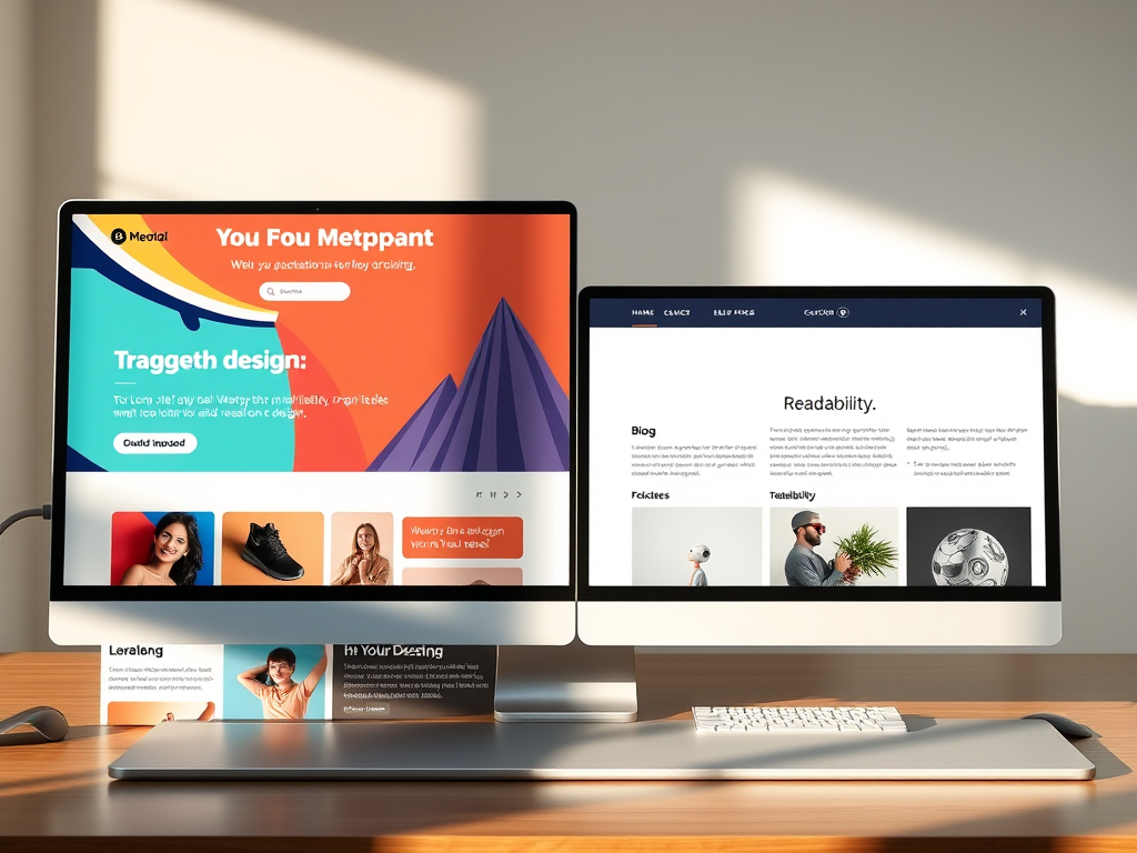
Why Different Website Sections Need Unique Designs
When building a website, one of the most overlooked yet critical questions is whether different sections of your site should have different designs, layouts, or coloring. While consistency is key for solid branding, certain pages benefit from a customized look that reflects their purpose. For instance, your homepage may need a bold, engaging hero image and bright call-to-action buttons, while your blog section would likely thrive with a more minimal layout that highlights readability. The right design choices can drastically improve user experience, conversion rates, and even your search engine optimization (SEO) performance.
In this article, we’ll explore why some sections of your site might need different layouts, delve into real-life design examples, unpack common technical challenges, and discuss how to balance consistency with flexibility. Whether you’re a business owner, designer, or developer, understanding when and how to diversify your site’s appearance can be a pivotal part of your digital strategy.
Understanding Why Each Site Section May Need a Unique Design
When users browse through a website, they subconsciously expect different types of interactions depending on the page they’re on. The homepage, for instance, acts as your digital storefront—it’s where first impressions happen. Contrast that with your blog or shop section: the goals shift from “attract and inform” to “educate” or “convert.” Because of this, a uniform design across all pages may actually hinder the natural flow of user behavior. A sales page might need vibrant colors to stimulate excitement, while a members’ dashboard benefits from a calm, neutral palette that fosters focus. Aligning design intent with each section’s purpose optimizes engagement and usability.
However, adopting different designs doesn’t mean you should abandon unity. Each section should still feel like part of the same family—through consistent typography, logo placement, and navigation. Think of it as a musical composition: different instruments play their own parts but still contribute to the same melody. For instance, company blogs like Shopify’s Ecommerce Blog or HubSpot’s Marketing Blog mirror their overall brand style but slightly adapt their color tones and layouts for better reading comfort.
Pros and Cons of Design Variation
Pros:
- Enhances user experience by tailoring design to page purpose
- Facilitates conversion through focused design elements
- Makes complex sites easier to navigate
Cons:
- Can increase design and maintenance costs
- May create brand inconsistency if not properly managed
- Requires extra testing across devices and browsers
Despite potential drawbacks, the advantages often outweigh the disadvantages when executed thoughtfully. Studies have shown that websites with section-specific layouts experience a 22% increase in average session duration, according to UX Planet’s 2023 user behavior analysis. This suggests users appreciate subtle design shifts that align with their navigation objectives.
Real-Life Examples Showing the Impact of Tailored Layouts
Let’s take a closer look at a few successful implementations of differentiated site sections. Airbnb employs distinct visual cues depending on user intent. Its homepage radiates trust and adventure through warm imagery and vibrant calls-to-action for exploring destinations. Once users switch to the “Host” section, the tone becomes instructional, featuring calm tones, minimal text, and step-by-step guidance. This deliberate contrast makes navigation intuitive—it tells users, “You’re in a different mode now.”
Similarly, Apple’s website leverages layout differentiation brilliantly. While product pages feature large imagery, white space, and minimal copy to focus visual attention on design aesthetics, the support section pivots to functional design elements—drop-downs, clear icons, and light blue tones—to emphasize clarity. The result is a consistent yet versatile experience across the brand’s vast digital ecosystem.
Another compelling case study comes from The New York Times. Their news and opinion sections maintain consistent typography but vary background tones and grid layouts to differentiate between article types. By doing this, users can subconsciously recognize whether they’re reading analysis, breaking news, or lifestyle content—without explicit labeling. This kind of adaptive visual language helps reduce cognitive load and enhances reader satisfaction.
Services That Support Multi-Section Designs
For those looking to implement multi-layout structures, here are a few services and tools that simplify this process:
- WordPress Page Builders: Elementor, Divi, and Beaver Builder allow drag-and-drop customization per page.
- Figma & Adobe XD: Helpful for creating design mockups before coding.
- Content Management Systems (CMS) like Webflow and Drupal—offer section-based templates for complex websites.
- UX Testing Tools such as Hotjar or Crazy Egg—help track how layout changes affect engagement.
These tools can demonstrate the measurable impact of design variety before committing to a complete redesign. They also make A/B testing easier, allowing you to compare different design variations across sections.
Balancing Consistency with Creativity
Maintaining a consistent brand experience across different layouts is one of the trickiest parts of web design. Users should never feel like they’ve left your brand’s environment when moving between sections. Achieve this by defining design tokens—like color palettes, spacing, and typography—that remain constant across all templates. For example, Google’s Material Design system uses universal rules to keep consistency even though apps and sites built with it vary widely in layout and use case.
On the flip side, creativity shouldn’t be stifled by strict rules. You can introduce variation through layout hierarchy or interactive elements that align with each page’s function. Think of your design system as a flexible framework, not a cage. Some popular sites even subtly shift color hues per page, creating a cohesive experience while evoking different emotions throughout the user journey.
Key Takeaways:
- Define a core brand style guide before branching into section-specific designs.
- Use grid systems to maintain alignment and rhythm.
- Implement color psychology—for example, blue for trust in support sections, red for urgency on product pages.
- Test your layouts dynamically—user feedback often uncovers unanticipated usability issues.
Consistency and creativity, when combined strategically, yield immersive digital experiences that users remember.
Troubleshooting Common Issues with Plugin Compatibility
When implementing different layouts and coloring across site sections—especially in platforms like WordPress—plugin conflicts can easily arise. Each plugin may introduce its own CSS or JavaScript, potentially overriding your site’s design rules. A frequent issue occurs when page builder plugins (like Elementor or WPBakery) load conflicting style sheets, disrupting color consistency.
Here are a few ways to troubleshoot such issues:
- Use selective plugin loading. Disable unnecessary plugins on specific pages to minimize conflicts.
- Inspect element styles. Using browser developer tools (like Chrome DevTools) can reveal which plugin is overriding theme styles.
- Enqueue scripts properly. If you’re using custom code, ensure scripts and styles are loaded conditionally based on page ID—reducing the risk of global interference.
- Test across staging environments. Before applying changes live, simulate multiple layouts in a staging site to check compatibility.
These steps can significantly reduce headaches during large-scale design updates. Another common issue arises from caching plugins—visual changes may not reflect immediately because of cached CSS. Always clear caches or disable them temporarily while you test new layouts.
Technical Tip:
If you notice persistent color mismatches or broken alignment, double-check your CSS specificity. Inline or plugin-generated styles usually override external stylesheets. Applying a higher specificity or using !important (sparingly) can help, but the best long-term fix is to structure your styles logically using a modular CSS approach (like BEM or utility-first frameworks such as Tailwind CSS).
Practical Implementation: How to Roll Out Section-Specific Designs
Before diving into coding, structure your website content wisely. Organize sections based on their goals—education, sales, support, or entertainment. Once content priorities are clear, designing respective layouts becomes intuitive. Start with wireframes to map user interactions, then draft mockups with varying colors and structures.
When developing, use separate templates for distinct site sections. For instance, in WordPress, you could create page-home.php, page-blog.php, or page-contact.php files, each with tailored layouts while maintaining a single global stylesheet. CSS variables make it easy to change color palettes dynamically—define a default theme and override it where necessary.
Also, optimize for accessibility. Each design variation must comply with WCAG 2.1 standards—contrast ratios, legible fonts, and proper alt texts remain non-negotiable. Diverse layouts shouldn’t compromise inclusivity. Testing tools like Wave Accessibility or Axe can validate your design choices.
Common Mistake to Avoid: Overcomplicating differences. Subtlety often works better. Minor background shifts, button colors, or header rearrangements may suffice to cue users they’re in a new area.

Evaluating Success Through Analytics
Once different designs are implemented, analytics help measure their effectiveness. Use tools like Google Analytics 4 or Matomo to monitor metrics such as bounce rate, time on page, and conversion paths across sections. The data may reveal that one color scheme retains users longer or that a simplified layout enhances mobile usability.
Incorporate heatmaps and scroll tracking to visualize how users interact with new layouts. For example, Hotjar’s 2023 report found that redesigning only a form layout improved completion rates by 18%. This reinforces that even modest adjustments per section can yield measurable impact.
Regularly iterate based on these insights. Websites are dynamic, living systems—periodic layout evaluations ensure your designs stay relevant as user behavior evolves. Setting quarterly redesign reviews or A/B tests for high-traffic pages is a best practice that differentiates leading digital experiences from stagnant ones.
Your website doesn’t live in a one-size-fits-all universe. Different sections naturally serve distinct purposes—so they deserve layouts and designs that match their goals. The secret lies in finding balance: diversifying enough to enrich user experience while maintaining consistency that reinforces your brand identity.
Think about your own digital space. Does your homepage invite, your blog educate, and your product pages persuade? If not, it may be time to revisit your design strategy. Start small with subtle color or layout shifts, monitor engagement metrics, and evolve gradually. Each change can bring you one step closer to a seamless, intelligent user experience that keeps visitors engaged longer and converts more effectively.
By blending creativity with analytical rigor, you can ensure every section of your site not only looks good—but works better.
FAST, SECURE WEB HOSTING FOR YOUR BUSINESS
Reliable Hosting for Your Business
Fast, secure and reliable hosting solutions designed to keep your website online, protected and ready to grow.
Standard Hosting
Fast, reliable hosting with the essential tools your business website needs.
- Fast, reliable hosting
- Free SSL security
- Professional email accounts
- 1-click WordPress setup
- Scalable for growing traffic
Domain Only
Register your domain with simple setup and flexible hosting options.
- Affordable yearly pricing
- Easy setup
- Works with any hosting
- Simple domain management
Reseller Hosting
Start your own hosting business or manage multiple client websites with flexible reseller hosting plans.
Reseller 1
- 10 Domains
- 100 GB Disk Space
- 2TB Bandwidth
- 100 Databases
- 100 Mailboxes
- WordPress Ready
Reseller 2
- 25 Domains
- 300 GB Disk Space
- 6TB Traffic
- 300 Databases
- 300 Mailboxes
- WordPress Ready
Reseller 3
- 50 Domains
- 600 GB Disk Space
- 12TB Traffic
- 600 Databases
- 600 Mailboxes
- WordPress Ready
Reliable web hosting with SSL, professional email, backups, and responsive technical support. Get the performance and support you need to keep your business website online and running smoothly.
Launching a new website or moving from another provider? Archer IT Solutions makes hosting simple, secure, and easy to manage.
WHY CHOOSE ARCHER IT?
Everything You Need to Keep Your Website Running Smoothly
⚡ 99.9% Uptime Guarantee
Keep your website available and accessible with reliable hosting infrastructure.
🔒 Free SSL Certificates
Protect your website and visitors with SSL security included with your hosting.
📧 Professional Business Email
Create professional email addresses using your own business domain.
⚙️ One-Click WordPress Installation
Get your WordPress website up and running quickly with easy installation.
💾 Automatic Daily Backups
Help protect your website data with regular automated backups.
🚀 Fast SSD Storage
Fast storage helps your website load efficiently and provides a smoother experience for visitors.
🛠️ 24/7 Technical Support
Get technical assistance when you need help with your hosting.
🔄 Website Migration Assistance
Move your existing website to Archer IT with assistance from the support team.
HOSTING THAT GROWS WITH YOUR BUSINESS
Whether you’re launching your first website or managing multiple client websites, Archer IT Solutions provides reliable hosting designed to support your business as it grows.
Our hosting solutions provide:
⚡ Fast Performance
🔒 Reliable Security
✓ Dependable Uptime
⚙️ Easy Website Management
🛠️ Local Expert Support
WHY BUSINESSES CHOOSE ARCHER IT HOSTING
Enterprise Security
Protect your website with free SSL certificates, malware protection, and secure hosting infrastructure.
Fast Performance
Optimized SSD storage helps your website load quickly and provides a smoother experience for visitors.
Expert IT Support
Get friendly, knowledgeable assistance when you need help with your hosting or website.
Automatic Daily Backups
Regular backups help protect your website data and make recovery easier when needed.
Professional Business Email
Create professional email addresses using your business domain to build trust with customers.
One-Click WordPress Installation
Get your WordPress website up and running quickly with easy installation.
15-DAY MONEY-BACK GUARANTEE
Try Archer IT Hosting Risk-Free
We’re confident in the reliability of our hosting services. If you’re not completely satisfied within your first 15 days, you can request a full refund.
No hidden fees.
No complicated process.
REAL PEOPLE. REAL SUPPORT.
When you need help, you can reach experienced IT professionals who understand your website and hosting needs.
Our team can assist with website migration, email setup, WordPress support, website troubleshooting, and hosting management.
Our team can help with
- Website migration
- Email setup
- WordPress support
- Website troubleshooting
- Hosting management
FREQUENTLY ASKED QUESTIONS
Find answers to common questions about Archer IT hosting, website migration, WordPress, security, and technical support.
What is web hosting?
Web hosting is a service that stores your website files and makes your website accessible on the internet.
Can you migrate my existing website?
Yes. Archer IT Solutions can help migrate your existing website to Archer hosting with minimal downtime.
Is SSL included?
Yes. Every hosting package includes a free SSL certificate to help protect your website and visitors.
Can I install WordPress?
Yes. Our hosting plans include one-click WordPress installation for quick and easy setup.
What happens if my website grows?
You can upgrade your hosting plan as your business and website requirements grow.
Do you provide IT support?
Yes. In addition to web hosting, Archer IT Solutions provides professional IT support to help keep your systems and technology running smoothly.
READY TO GET YOUR WEBSITE ONLINE?
Give your business a reliable foundation with professional web hosting and responsive IT support from Archer IT Solutions. Let us help you get online with confidence.


No responses yet