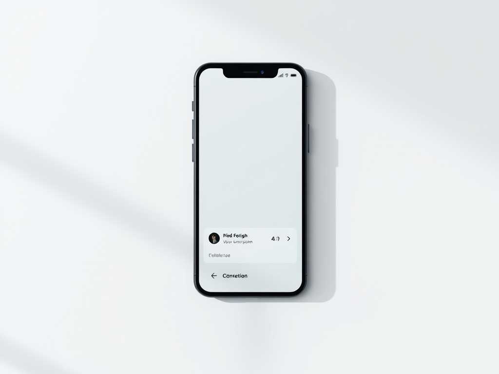
The Power of Minimalism in UX Design
In a world where digital experiences dominate everything from productivity tools to entertainment, the concept of “less is more” has become increasingly important. When users open an app or website cluttered with too many elements, the result is overwhelming and confusing. This visual clutter not only slows user navigation but can also reduce satisfaction and task efficiency. Designers today face a growing challenge: how can they maintain functionality while simplifying interfaces in UX Design? The answer often lies in hiding some content or options—without compromising access or usability.
This article explores real examples of companies that have successfully hidden secondary content to reduce visual clutter, examines the benefits and drawbacks of this design approach, and discusses tools and techniques that can help. Whether you’re a web designer, app developer, or someone seeking better UX experiences, understanding how to declutter visually is essential to improving both user experience and engagement.
Real Examples of Simplifying Interfaces With Hidden Options
Hiding Complexity in Productivity Apps
A prime example of using hidden content to improve usability can be found in productivity tools like Notion and Trello. These platforms offer extensive functionality but rely heavily on collapsible sections, modals, and layered menus to maintain a clean interface. For instance, Trello’s card details remain hidden until clicked, allowing the main board to look minimal and distraction-free. Similarly, Notion allows users to collapse entire pages or toggle lists, so only the most relevant information remains visible by default. This approach helps the user focus on the current task rather than facing a wall of options.
Statistics show that interface simplicity significantly impacts usability and satisfaction. According to a 2019 Google UX Report, users are 20% more likely to engage longer with websites that adopt minimalist and decluttered designs. The use of hidden elements facilitates faster scanning, reducing cognitive load and enabling smoother interaction. When the user’s eyes aren’t darting around various elements, they make decisions more comfortably and efficiently.
Another great use case is Google Search itself, which began as the epitome of minimalist design. Its homepage famously consists of a single search bar and minimal other visual noise. Advanced filters and settings remain tucked away behind small icons or dropdowns, allowing users who need them to easily find them without overwhelming casual users. This hidden-by-design approach makes Google Search accessible to everyone—novices and power users alike.
The Role of Progressive Disclosure in UX Design
The concept of progressive disclosure—a UX principle that reveals information sequentially to prevent overwhelming users—plays a central role in managing visual clutter. This technique guides users through essential tasks first, revealing advanced features only when needed. For instance, Apple’s iOS settings menus use nested panels that expand only when the user opts to view more details. Rather than confronting users with every possible option, this system gently reveals complexity as it becomes relevant.
Another strong implementation of this approach appears in GitHub’s interface, where complex developer tools are hidden behind expandable “advanced settings.” Developers appreciate the platform’s efficiency because it doesn’t flood them with rarely-used controls. These features are available but not intrusive. This principle of progressive disclosure ensures the initial visual experience remains minimal but functional.
Even everyday websites employ similar tactics. For example, Amazon’s product pages show essential purchasing information first, but panels for “technical details” or “customer questions” are collapsed until clicked. This method makes shopping easier and less cognitively taxing, particularly for users browsing multiple products. By hiding secondary elements, the experience becomes both more streamlined and more user-friendly.
Streamlined Workflows and Responsive Interfaces
In responsive web design, hidden content plays an essential role in adapting layouts to various screen sizes. Mobile devices, with their limited screens, naturally demand cleaner layouts. Designers often use hamburger menus or dropdown accordions to hide secondary options. While this design pattern occasionally sparks debate, it remains one of the most effective solutions for maintaining usability on small screens. Spotify’s mobile interface is a good example, keeping the main player accessible while hiding playlist management tools behind simple icons.
Similarly, Microsoft Word Online and Google Docs use collapsible tool ribbons, which allow users to focus solely on writing. These ribbons present only core features but expand to reveal the full set of tools when needed. This system saves vertical space and offers the perfect balance between simplicity and power.
- Key takeaway: Hidden options aren’t about removing features—they’re about prioritizing visibility.
- Key advantage: Clean interfaces reduce distractions, helping users complete tasks faster.
- Key caution: Hiding functionality that users expect in plain view can create frustration if not well signaled.

Key Benefits, Challenges, and Tools for Reducing Screen Clutter In UX Design
Benefits of Hiding Content and Reducing Visual Noise
Simplified layouts not only improve focus but also enhance overall accessibility. When clutter is reduced, people with visual or cognitive impairments find it easier to navigate. Screen readers and assistive technologies perform better on minimalist, structured layouts. According to a 2022 Nielsen Norman Group study, reducing visual complexity by just 20% can improve task completion rates by 35% among users with accessibility needs.
From a usability perspective, decluttered design can:
- Increase task efficiency and accuracy.
- Lead to greater user satisfaction and retention.
- Improve the speed at which users recognize interactive elements.
- Lower bounce rates on websites.
Another important aspect is aesthetics and trust. Clean designs often appear more professional and intuitive. Research from the Stanford Web Credibility Project shows that 46% of consumers judge website credibility based on design quality, particularly simplicity. Thus, hiding non-essential content not only improves functionality but also influences perception positively.
Common Drawbacks and Troubleshooting Compatibility Issues
Of course, hiding content is not without downsides. One major issue occurs when plugins or scripts conflict with hidden elements. In WordPress, for example, certain page builders like Elementor or Divi occasionally hide content behind accordions or tabs that third-party plugins cannot read properly—leading to SEO or accessibility problems. Such conflicts can cause hidden content not to load or display incorrectly, confusing users.
Troubleshooting tips:
- Always test accordion or tabbed content on multiple devices and browsers.
- Use ARIA attributes (
aria-expanded,aria-hidden) to ensure accessibility is preserved. - Monitor plugin updates to prevent incompatibilities after CMS updates.
- Make sure interactive hidden elements load in the DOM properly even when not visible, so they remain discoverable by search engines.
This leads to another important reminder: declarative hiding (using CSS like display:none) differs from dynamic hiding (using JavaScript for toggling). Developers must ensure hidden elements do not completely disappear from accessibility tools or analytics tracking unless intended. Proper coding practices safeguard user access without compromising the minimalist effect.
Tools and Frameworks for Designing Cleaner Interfaces
Designers today have powerful resources to manage hidden content elegantly. Frameworks such as Bootstrap, Tailwind CSS, and Material UI offer built-in components for accordions, modals, and collapsible panels. These ensure consistent and accessible behavior across devices. Additionally, Figma, Adobe XD, and Sketch allow designers to prototype responsive layouts with progressive visibility states, helping clients and teams visualize clutter-free UX early in the process.
Developers can also rely on lightweight libraries—like Alpine.js or React’s hooks—to manage dynamic visibility without bloated scripts. The goal is to implement toggling effects that feel natural and fast, preserving both performance and readability.
When evaluating tools or frameworks for decluttering, consider:
- Their accessibility compliance policies (especially for WCAG).
- The degree of customization for visibility animations and transitions.
- Plugin ecosystem and cross-compatibility.
By combining UX principles with the right tools, designers can create intuitive systems that make every click meaningful without overwhelming the user.
Pros and Cons of Hiding Options to Reduce Clutter
Pros:
- Enhances user focus on the core experience.
- Makes interfaces appear cleaner and more professional.
- Reduces cognitive load and distraction.
- Facilitates responsive, mobile-friendly design.
Cons:
- May cause discoverability issues if users can’t find hidden features.
- Risk of over-simplifying critical features or controls.
- Potential plugin conflicts and accessibility problems if poorly implemented.
- Can require more testing and user education.
The best practice is moderation. Not all clutter is bad—some visible elements, like navigation cues or status indicators, help orient users. The real art lies in determining what should stay visible and what should hide.
Encouraging User Engagement Through Smart Visibility Choices
Hiding interface elements should never mean hiding opportunity. Designers should look for ways to invite curiosity—such as using subtle animations or small hint icons indicating expandable sections. When users feel rewarded for exploring, engagement increases. For instance, Slack’s sidebar customization allows teams to collapse or expand channels depending on current priorities, enabling both focus and flexibility.
As digital ecosystems evolve, personalization becomes vital. AI-driven customization systems, like those found in Figma’s Auto Layout or Notion’s AI assistant, can automatically suggest which panels or properties to hide or show based on user habits. These predictive visibility systems enhance usability over time.
Ultimately, the best-hidden designs are those that users hardly notice. When done right, hiding options simply feels like a natural part of a smooth workflow rather than a limitation.

Reducing visual clutter by hiding certain interface elements is far more than an aesthetic choice—it’s a usability philosophy grounded in human cognition and design psychology. Real-world examples like Google, Trello, and Apple show that simplicity doesn’t mean sacrificing power. With thoughtful application of progressive disclosure, accessibility compliance, and careful testing, any digital product can achieve clarity without compromise.
If you’re designing a website, working on an app, or simply trying to streamline a dashboard, begin by asking: What truly deserves users’ attention first? From there, gradually hide or minimize the rest. Observe analytics, gather feedback, and refine—because great design is never static.
Think about your daily digital interactions: how often do you feel overwhelmed by too many buttons, sections, or pop-ups? Reflect on which tools you use that bring you “visual calm.” By applying some of their design principles, you too can build cleaner, smoother, and more delightful user experiences that respect both information and the human eye.
FAST, SECURE WEB HOSTING FOR YOUR BUSINESS
Reliable Hosting for Your Business
Fast, secure and reliable hosting solutions designed to keep your website online, protected and ready to grow.
Standard Hosting
Fast, reliable hosting with the essential tools your business website needs.
- Fast, reliable hosting
- Free SSL security
- Professional email accounts
- 1-click WordPress setup
- Scalable for growing traffic
Domain Only
Register your domain with simple setup and flexible hosting options.
- Affordable yearly pricing
- Easy setup
- Works with any hosting
- Simple domain management
Reseller Hosting
Start your own hosting business or manage multiple client websites with flexible reseller hosting plans.
Reseller 1
- 10 Domains
- 100 GB Disk Space
- 2TB Bandwidth
- 100 Databases
- 100 Mailboxes
- WordPress Ready
Reseller 2
- 25 Domains
- 300 GB Disk Space
- 6TB Traffic
- 300 Databases
- 300 Mailboxes
- WordPress Ready
Reseller 3
- 50 Domains
- 600 GB Disk Space
- 12TB Traffic
- 600 Databases
- 600 Mailboxes
- WordPress Ready
Reliable web hosting with SSL, professional email, backups, and responsive technical support. Get the performance and support you need to keep your business website online and running smoothly.
Launching a new website or moving from another provider? Archer IT Solutions makes hosting simple, secure, and easy to manage.
WHY CHOOSE ARCHER IT?
Everything You Need to Keep Your Website Running Smoothly
⚡ 99.9% Uptime Guarantee
Keep your website available and accessible with reliable hosting infrastructure.
🔒 Free SSL Certificates
Protect your website and visitors with SSL security included with your hosting.
📧 Professional Business Email
Create professional email addresses using your own business domain.
⚙️ One-Click WordPress Installation
Get your WordPress website up and running quickly with easy installation.
💾 Automatic Daily Backups
Help protect your website data with regular automated backups.
🚀 Fast SSD Storage
Fast storage helps your website load efficiently and provides a smoother experience for visitors.
🛠️ 24/7 Technical Support
Get technical assistance when you need help with your hosting.
🔄 Website Migration Assistance
Move your existing website to Archer IT with assistance from the support team.
HOSTING THAT GROWS WITH YOUR BUSINESS
Whether you’re launching your first website or managing multiple client websites, Archer IT Solutions provides reliable hosting designed to support your business as it grows.
Our hosting solutions provide:
⚡ Fast Performance
🔒 Reliable Security
✓ Dependable Uptime
⚙️ Easy Website Management
🛠️ Local Expert Support
WHY BUSINESSES CHOOSE ARCHER IT HOSTING
Enterprise Security
Protect your website with free SSL certificates, malware protection, and secure hosting infrastructure.
Fast Performance
Optimized SSD storage helps your website load quickly and provides a smoother experience for visitors.
Expert IT Support
Get friendly, knowledgeable assistance when you need help with your hosting or website.
Automatic Daily Backups
Regular backups help protect your website data and make recovery easier when needed.
Professional Business Email
Create professional email addresses using your business domain to build trust with customers.
One-Click WordPress Installation
Get your WordPress website up and running quickly with easy installation.
15-DAY MONEY-BACK GUARANTEE
Try Archer IT Hosting Risk-Free
We’re confident in the reliability of our hosting services. If you’re not completely satisfied within your first 15 days, you can request a full refund.
No hidden fees.
No complicated process.
REAL PEOPLE. REAL SUPPORT.
When you need help, you can reach experienced IT professionals who understand your website and hosting needs.
Our team can assist with website migration, email setup, WordPress support, website troubleshooting, and hosting management.
Our team can help with
- Website migration
- Email setup
- WordPress support
- Website troubleshooting
- Hosting management
FREQUENTLY ASKED QUESTIONS
Find answers to common questions about Archer IT hosting, website migration, WordPress, security, and technical support.
What is web hosting?
Web hosting is a service that stores your website files and makes your website accessible on the internet.
Can you migrate my existing website?
Yes. Archer IT Solutions can help migrate your existing website to Archer hosting with minimal downtime.
Is SSL included?
Yes. Every hosting package includes a free SSL certificate to help protect your website and visitors.
Can I install WordPress?
Yes. Our hosting plans include one-click WordPress installation for quick and easy setup.
What happens if my website grows?
You can upgrade your hosting plan as your business and website requirements grow.
Do you provide IT support?
Yes. In addition to web hosting, Archer IT Solutions provides professional IT support to help keep your systems and technology running smoothly.
READY TO GET YOUR WEBSITE ONLINE?
Give your business a reliable foundation with professional web hosting and responsive IT support from Archer IT Solutions. Let us help you get online with confidence.


No responses yet