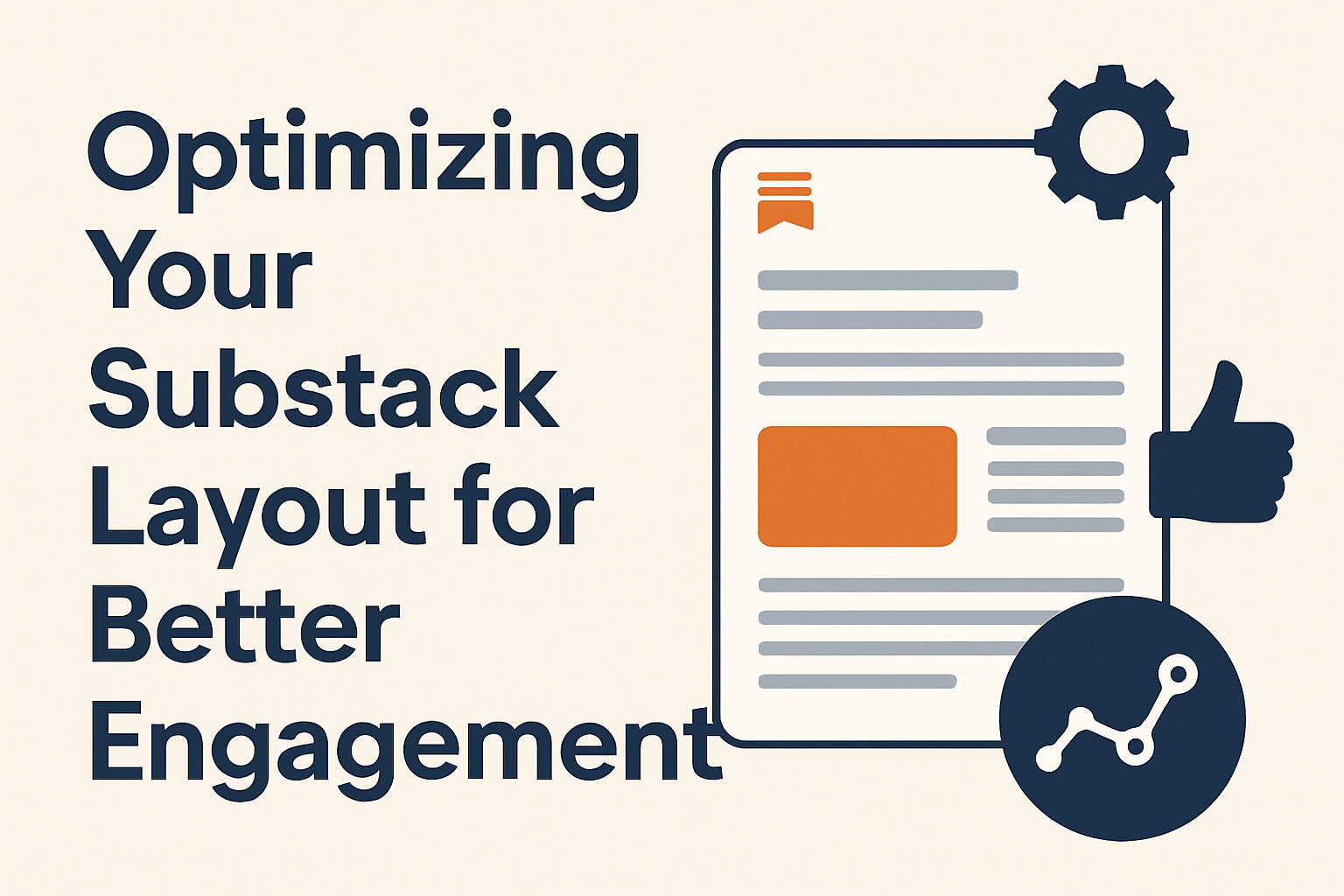
Optimizing Your Substack Layout for Better Engagement

Your Substack layout isn’t just a design choice—it’s the core of how readers perceive and interact with your content. A well-organized and visually intuitive design can increase your open rates, reading time, and overall subscriber engagement. Understanding where users focus, how they scroll, and what visual triggers prompt them to read further can entirely transform the effectiveness of your publication.
Structuring Your Substack Layout for Maximum Clarity
When configuring your Substack layout, clarity always takes precedence. Visitors often scan content using an “F-shaped” reading pattern, concentrating their attention on the top-left area before moving down the page. To capture and retain attention, position your key information—headlines, CTAs, and headers—in those focal zones. Thoughtfully distributed white space can act as a visual pause, reducing reader fatigue and increasing comprehension.
To maximize clarity, each section of your post should serve a distinct purpose. Headings must act as navigational anchors, making it simple for users to skim and locate points of interest quickly. Consider breaking longer text sections into digestible chunks with clear subheadings, bullet points, and relevant visuals. This helps guide eye movement and conveys professionalism.
Key Takeaways:
- Prioritize content in top-left and center areas.
- Use consistent white space for readability.
- Label sections with descriptive, scan-friendly headings.
For deeper understanding of digital content reading patterns, check resources like Nielsen Norman Group’s Eye Tracking Studies or Smashing Magazine’s Visual Design Guides.
Visual Strategies That Drive Higher Reader Engagement
Your layout’s visual hierarchy determines how readers navigate and emotionally respond to your content. Elements such as color, size, and typography create visual entry points, drawing attention to what matters most. A well-balanced combination of contrasting colors and clean typography can make a huge difference in how approachable your posts feel. Professional imagery also communicates tone, showing consistency and brand credibility.
Incorporate visuals thoughtfully to avoid cluttering pages. For example, insert images or infographics every few paragraphs to reinforce the message rather than distract. Likewise, customize CTA buttons with consistent brand colors—contrasting enough to catch attention but not so bright that they overwhelm the page. According to recent user-interface research, color-coordinated CTAs improve interaction rates by up to 28%.
Pros and Cons of Complex Visual Layouts
Pros:
- Stronger brand identity
- Improved user retention
- Increased conversion potential
Cons:
- Slower load times if unoptimized
- Possible distraction from main content
- Compatibility issues with plugins or themes
For guidance on color theory and accessibility, explore Coolors Color Toolkit or Contrast Checker by WebAIM.
Troubleshooting Common Plugin Compatibility Issues
Sometimes, Substack creators encounter issues when integrating third-party plugins or custom scripts into their newsletters. These issues can include conflicts with embedded forms, font rendering problems, or display inconsistencies across devices. Often, these arise from outdated browser caches, CSS overrides, or untested widget placements.
To troubleshoot, start by disabling extra plugins one by one to isolate the issue. Always preview changes on both desktop and mobile before publishing. Maintaining regular backups before layout modifications ensures you can roll back quickly if needed. For newsletter creators using external hosting services, ensure your platform supports the scripts you’re embedding.
If you’re using Archer IT Solutions’ web hosting or design services, you can reach out to their support team at https://www.archer-its.com/ticket or via support@archer-its.com for quick help—most inquiries are answered within 24 hours. Their managed IT and web design services provide hands-on technical guidance that can greatly reduce troubleshooting complexity.
An optimized Substack layout isn’t just about aesthetics—it’s about engagement, clarity, and connection. By understanding how readers naturally navigate digital content and applying principles of visual hierarchy and simplicity, you can transform casual visitors into loyal subscribers.
If you’re ready to elevate your Substack presence or troubleshoot technical layouts, Archer IT Solutions offers complete support in web design, hosting, and content structure optimization. Visit www.archer-its.com/web-design-services or email sales@archer-its.com to explore options tailored to your publication goals.
Take time to reflect on your design needs today—what story is your layout telling your audience? Enhancing clarity now can result in higher engagement, more subscribers, and stronger reader relationships tomorrow.
Summary
- Use clear structure, prioritizing readability and flow.
- Apply visual hierarchy through consistent use of headlines, colors, and CTAs.
- Seek expert help from Archer IT Solutions for technical or layout-related guidance.
- Always test across devices before publishing for maximum compatibility.
Discover more from Archer IT Solutons
Subscribe to get the latest posts sent to your email.
No responses yet