Optimizing Landing Pages Through A/B Testing Strategies
An effective landing page can make or break your online conversion rates. With user attention spans growing shorter, testing and refining landing pages through A/B testing is essential to find what drives clicks, sign-ups, and sales. By understanding how visitors navigate and interact with your page, you can adjust content, layout, and visuals to maximize engagement. For businesses like Archer IT Solutions—who specialize in web design, hosting, and managed IT services—A/B testing is a key process in crafting experiences that perform better over time.
Understanding User Behavior in A/B Landing Tests
When optimizing landing pages through A/B testing, the first step is understanding how users interact with your page. Studies in user experience show that most visitors follow an F-shaped scanning pattern, meaning they prioritize the top and left sections of a page first. This knowledge enables you to place critical information, like calls to action or value propositions, where they receive maximum visibility. For example, placing the “Get a Quote” button in the top-left or central area can capture users earlier in their session.
Next, it’s essential to segment audiences to identify behavioral differences. A/B testing can reveal that mobile users respond better to concise, vertically aligned layouts, whereas desktop users prefer visual variety. By continuously analyzing click heatmaps and scroll depth, teams can refine the page structure and copy to encourage deeper engagement. Archer IT Solutions often supervises these performance insights for clients upgrading their web design or hosting pages.
A significant advantage of A/B testing is that it removes guesswork from design decisions. Instead of relying solely on intuition, each test provides measurable outcomes. However, it’s essential to avoid common pitfalls such as running tests too briefly or testing too many elements at once, which can yield unreliable results. Successful optimization comes from incrementally adjusting single elements—headlines, button colors, or hero images—and using analytics tools like Google Optimize or Hotjar for real-time behavior tracking.
Designing Effective Visual Hierarchies for Conversions
Visual hierarchy determines where a user’s eyes go first, and structuring this hierarchy strategically can make your A/B tests more successful. Larger headlines, contrasting colors, and directional elements guide the user to important features, forming a natural pathway through your information. For example, a bold headline followed by a minimalist subheader and clear CTA button helps users understand what to do next without hesitation.
White space plays a powerful role in maintaining focus. Cramming too much text or too many visuals can make a page overwhelming, whereas intentional spacing allows elements to stand out. Archer IT Solutions’ web design services implement these principles by creating balanced page structures that emphasize clarity. In A/B testing terms, one version might feature a vibrant layout with multiple CTAs, while another emphasizes a streamlined design focusing on a single conversion point—data will show which design drives better results.
Pros and Cons of A/B Landing Page Testing
Pros:
- Provides specific data on what increases conversions.
- Supports continuous improvement of design and copy.
- Reduces risk by testing before implementing major changes.
Cons:
- Requires patience for statistically significant results.
- May lead to misinterpretation if variables overlap.
- Needs consistent traffic to yield reliable insights.
Troubleshooting Tip: If your A/B test shows no clear winner, check your traffic volume or seasonality. Low traffic or external events may skew results. Also, ensure each variation tests only one distinct element at a time.
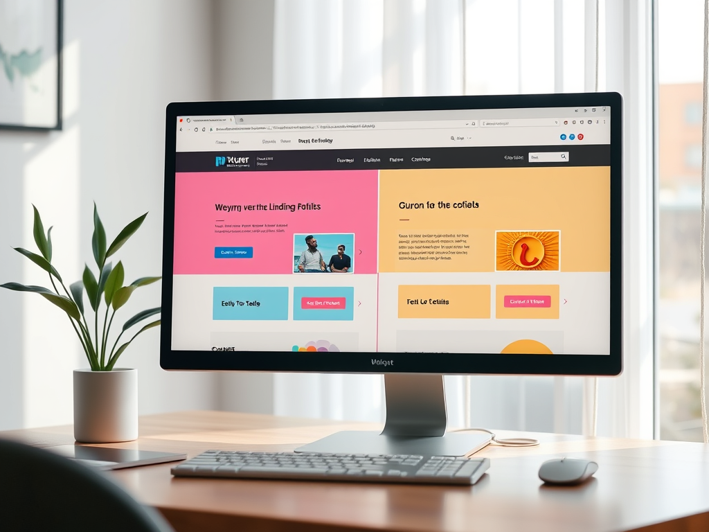
Example Visualization

Example of visual hierarchy guiding a user’s eye toward a CTA button (image source: Pexels).
For additional guidance, you can explore this educational article on UX Planet about visual hierarchy.
Call to Action
If you are looking to refine your landing pages or assess performance through reliable A/B testing, Archer IT Solutions provides expert guidance and implementation. Whether you need optimized web hosting, web design, or full managed IT support, our teams ensure performance improvements are data-driven. For assistance, email support@archer-its.com.
Optimizing landing pages through A/B testing strategies transforms your web performance from guesswork into calculated improvement. By understanding user scanning behavior and designing layouts guided by visual hierarchy, your website becomes more user-friendly and conversion-oriented. Businesses that commit to ongoing experimentation, such as clients of Archer IT Solutions, can continually refine their digital presence to stay competitive. In the end, the best landing pages are not just visually appealing—they’re endlessly tested, measured, and improved.
Discover more from Archer IT Solutons
Subscribe to get the latest posts sent to your email.
No responses yet