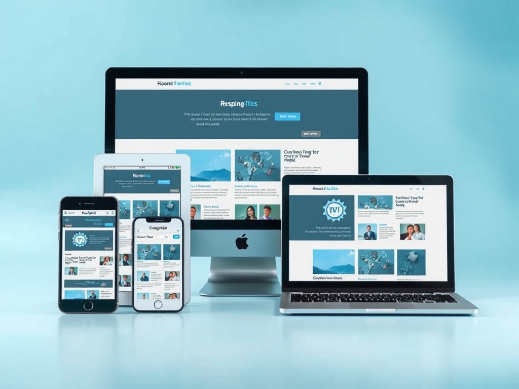
In today’s digital environment, user expectations are more diverse than ever. Websites and applications must adapt seamlessly to multiple devices—mobile phones, tablets, and desktop computers—each with its own constraints and possibilities. Designing for varied viewports is not simply a matter of aesthetics; it’s a strategic process that impacts usability, performance, and ultimately, engagement. Responsive design ensures that every user, regardless of device, has an optimal experience.
Understanding Responsive Design Needs Across Devices
Modern responsive design depends on understanding how users interact differently across devices. For instance, mobile users tend to favor simplicity and speed, while desktop users expect detailed layouts and advanced functionality. According to Statista, mobile devices accounted for over 58% of global web traffic in 2023, emphasizing the importance of ensuring that mobile viewports deliver fast load times and clear navigation.
For tablet viewports, designers often focus on touch-friendly interfaces that use more generous spacing and intuitive gestures. Desktop screens, conversely, have the advantage of larger displays that can present rich media and complex data visualizations. The goal is not uniformity but intentional adaptability—understanding that each viewport supports unique user behaviors.
Key takeaways:
- Responsive design prioritizes flexibility across device types.
- Performance optimization differs between mobile, tablet, and desktop.
- UI elements should adjust naturally to match user intent and screen size.
Real-World Case Studies Highlighting Viewport Strategies
A notable case is the redesign of BBC News, which implemented a responsive grid system that adapts to various screen widths. On mobile, their interface compresses content using vertical scrolling, while tablets benefit from two-column layouts that show more context. Desktop users get access to a multi-column structure allowing faster navigation through multiple topics. This fluid adaptability increased their page session time by 22% after the change.
Another example is Airbnb’s design system, which uses breakpoints and reusable components to optimize for viewport changes. Their design team observed that mobile users were completing bookings faster after implementing a simplified mobile layout, increasing conversion rates. These real-life applications demonstrate that understanding each device’s constraints and opportunities leads to tangible results.
Viewport-specific benefits observed:
- Mobile: Better performance and accessibility.
- Tablet: Smoother transitions and improved touch-based usability.
- Desktop: Enhanced multitasking and content density.

Designing for multiple viewports is more than merely resizing content; it’s about crafting tailored experiences rooted in user context. Whether your audience browses on a phone during a commute or analyzes data on a widescreen monitor, responsive strategies ensure consistent satisfaction. As you plan or refine your next project, take time to ask yourself: Do your viewport requirements genuinely reflect how your users interact with your platform? Thoughtful, data-backed adaptation is the foundation of user-centric digital design.
Discover more from Archer IT Solutons
Subscribe to get the latest posts sent to your email.
No responses yet