Understanding Visual Content Separation Basics
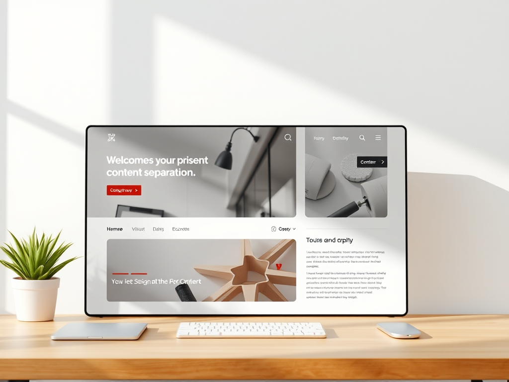
Visual content separation is a fundamental aspect of web design that involves organizing and structuring content in a way that enhances readability and user experience. By effectively separating different elements on a webpage, designers can guide users through the content seamlessly, ensuring that information is easily digestible. This separation can be achieved through various design techniques, such as the use of white space, color contrasts, and distinct typography. The goal is to create a visual hierarchy that naturally leads the viewer’s eye from one section to another, making the content more engaging and less overwhelming.
At its core, visual content separation is about creating a balance between different elements on a page. This balance helps in reducing cognitive load, allowing users to focus on the most important information without being distracted by clutter. By strategically placing elements and using design principles like alignment and proximity, designers can create a cohesive and intuitive layout. This not only improves readability but also enhances the overall aesthetic appeal of the website, making it more likely for users to stay longer and interact with the content.
Importance of Readability in Web Design
Readability is a critical component of web design that directly impacts user engagement and retention. A website with high readability ensures that users can easily understand and process the information presented to them. This is particularly important in an age where users are bombarded with information and have limited attention spans. A well-designed website with clear and readable content can capture and hold the user’s attention, leading to higher conversion rates and improved user satisfaction.
Moreover, readability is not just about the text itself but also how it is presented. Factors such as font size, line spacing, and paragraph length all contribute to how easily content can be read and understood. By prioritizing readability, designers can create a more inclusive web experience that caters to a diverse audience, including those with visual impairments or reading difficulties. Ultimately, enhancing readability through effective design practices is essential for creating a user-friendly website that meets the needs of its audience.
Effective Use of White Space Techniques
White space, also known as negative space, is a powerful tool in web design that can significantly enhance readability and visual appeal. It refers to the empty space around and between elements on a page, and when used effectively, it can help to create a clean and organized layout. White space allows content to breathe, reducing clutter and making it easier for users to focus on the essential information. By strategically incorporating white space, designers can improve the overall flow of the page and guide users’ attention to key areas.
One effective technique for using white space is to increase the margins and padding around text and images. This creates a buffer that separates different sections, making the content more digestible. Additionally, white space can be used to highlight important elements, such as call-to-action buttons or headlines, by isolating them from other content. This not only draws attention to these elements but also enhances the overall user experience by creating a more visually appealing and easy-to-navigate website.
Incorporating Color for Content Clarity
Color is a vital element in web design that can be used to enhance content clarity and readability. By using contrasting colors, designers can create a visual hierarchy that guides users through the content. For example, using a bold color for headlines and a more subdued color for body text can help to differentiate between different types of information. This makes it easier for users to scan the page and quickly find the information they are looking for.
In addition to creating contrast, color can also be used to evoke emotions and convey meaning. For instance, warm colors like red and orange can create a sense of urgency, while cool colors like blue and green can have a calming effect. By understanding the psychological impact of color, designers can create a more engaging and effective user experience. However, it is important to use color judiciously and ensure that there is sufficient contrast between text and background to maintain readability for all users, including those with color vision deficiencies.
Utilizing Typography for Better Readability
Typography plays a crucial role in enhancing readability on a website. The choice of font, size, and style can significantly impact how easily users can read and understand the content. A well-chosen typeface can convey the tone and personality of the brand while ensuring that the text is legible across different devices and screen sizes. Sans-serif fonts, for example, are often preferred for digital content due to their clean and modern appearance, which enhances readability on screens.
In addition to font choice, other typographic elements such as line height, letter spacing, and alignment also contribute to readability. Adequate line height ensures that lines of text are not too close together, reducing eye strain and making it easier for users to follow along. Similarly, appropriate letter spacing can prevent letters from appearing cramped, improving overall legibility. By paying attention to these typographic details, designers can create a more accessible and enjoyable reading experience for users.
Designing with Consistent Layout Patterns
Consistency in layout patterns is essential for creating a cohesive and user-friendly website. By using consistent design elements, such as grid systems and alignment, designers can create a sense of order and predictability that enhances readability. A consistent layout helps users to navigate the website more easily, as they can quickly identify patterns and understand how information is organized. This reduces cognitive load and allows users to focus on the content rather than figuring out how to interact with the site.
Moreover, consistent layout patterns contribute to a professional and polished appearance, which can enhance the credibility and trustworthiness of the website. By maintaining uniformity in design elements such as headers, footers, and navigation menus, designers can create a seamless experience that reinforces the brand identity. Consistency also extends to the use of colors, typography, and imagery, ensuring that all elements work together harmoniously to support the overall message and goals of the website.
Implementing Visual Hierarchy Strategies
Visual hierarchy is a key principle in web design that involves arranging elements in a way that reflects their importance. By using size, color, contrast, and positioning, designers can create a hierarchy that guides users’ attention to the most critical information first. For example, larger and bolder text can be used for headlines, while smaller text is used for body content. This helps users to quickly scan the page and understand the structure of the information presented.
In addition to text, visual hierarchy can also be applied to images, buttons, and other design elements. By strategically placing these elements and using visual cues such as arrows or lines, designers can direct users’ attention and encourage them to take specific actions. Implementing visual hierarchy effectively not only enhances readability but also improves the overall user experience by making it easier for users to navigate the website and find the information they need.
Testing and Analyzing Readability Improvements
Once readability enhancements have been implemented, it is crucial to test and analyze their effectiveness. User testing is a valuable method for gathering feedback on how well the design changes have improved readability and user experience. By observing how users interact with the website and collecting their feedback, designers can identify areas for further improvement and make data-driven decisions to optimize the design.
In addition to user testing, analytics tools can provide insights into how readability improvements impact user behavior. Metrics such as bounce rate, time on page, and conversion rates can indicate whether the changes have had a positive effect on user engagement. By continuously monitoring these metrics and making iterative adjustments, designers can ensure that the website remains user-friendly and meets the evolving needs of its audience. This ongoing process of testing and analysis is essential for maintaining a high level of readability and ensuring the long-term success of the website.
 Mini Mini | Standard | Domain Only |  Reseller 1 Reseller 1 | Reseller 2 | Reseller 3 |
| $12 per year | $9.99/month | low yearly prices | $20/month | $37.50/month | $50/month |
| *10 GB Space** *100 GB Bandwidth** *FTP access *10 email account *PHP/CGI/PERL/SSI Support *SSL | *100 GB Space** *1TB Bandwidth** *10 FTP accounts *100 email account *PHP/CGI/PERL/SSI Support *10 Databases *SSL WordPress, Joomla, or Drupal hosting | *10 Domains *10 GB Diskspace *200 GB of traffic *10 Databases *10 Mailboxes *WordPress options | *25 Domains *30 GB Diskspace *600 GB of traffic *30 Databases *30 Mailboxes *WordPress options | *50 Domains *60 GB Diskspace *1200 GB of traffic *60 Databases *60 Mailboxes *WordPress options | |
| Specials | |||||
 3 months on us. 1TB Bandwidth, FTP accounts, email accounts, PHP/CGI/PERL/SSI SupportD, Databases, Ability to add WordPress, Joomla, or Drupal. 3 months on us. 1TB Bandwidth, FTP accounts, email accounts, PHP/CGI/PERL/SSI SupportD, Databases, Ability to add WordPress, Joomla, or Drupal.
Don’t wait — grab your deal and launch today ** temporary offered | |||||
Discover more from Archer IT Solutons
Subscribe to get the latest posts sent to your email.
No responses yet