Effective Color Use in Site Design for User Focus
Color is one of the most powerful elements in digital design—it not only influences how users perceive a website but also how they navigate and engage with it. Whether intentional or not, every hue and shade contributes to the user’s journey through contrast, balance, and visual guidance. Understanding effective color use in site design can help ensure your web content captures attention, directs focus, and reinforces branding.
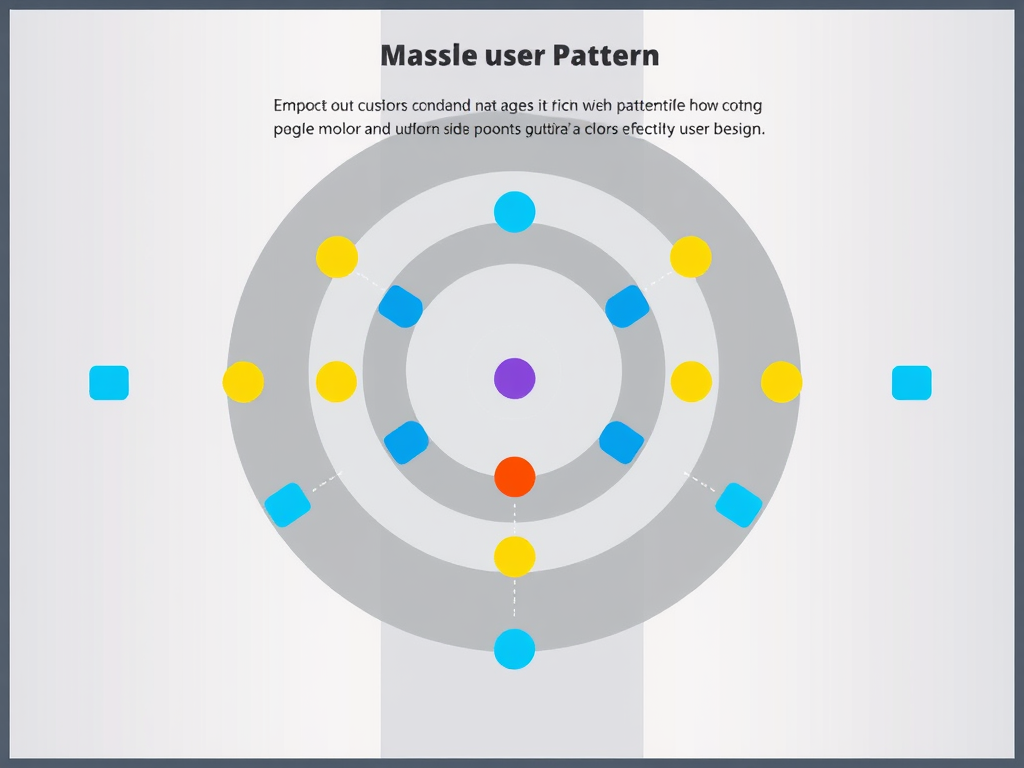
Understanding How Color Guides User Attention Online
Color acts as a roadmap for the eyes, subtly guiding users through the digital experience. Studies on user scanning patterns reveal that visitors naturally start at the top-left corner of a page before moving diagonally downward in an “F-pattern.” Smart color use supports this behavior—highlighting key buttons, forms, or calls-to-action in contrasting colors ensures they stand out immediately. For instance, a bright blue “Learn More” button against a white background grabs attention faster than a muted tone would.
Incorporating effective color use also enhances accessibility. Designers should maintain appropriate contrast ratios between text and background colors for readability, particularly for users with visual impairments. Tools like WebAIM’s Contrast Checker are useful for verifying compliance with accessibility standards. However, it’s equally important not to oversaturate the layout. Overuse of highly saturated hues can fatigue the eyes and confuse viewers about where to look next, diminishing focus instead of improving it.
From a branding perspective, color psychology plays a pivotal role in influencing emotion and behavior. Blue often signals professionalism and security—ideal for technology and financial firms—while orange can evoke excitement and energy, fitting for creative businesses. For IT and web hosting companies such as Archer IT Solutions, consistent color palettes communicate reliability and modernity, helping users navigate support pages, view hosting plans, or request on-site IT service without distraction.
Suggested image: Diagram showing website scanning pattern (F-pattern) and how color highlights guide user attention.
Building Visual Hierarchy Through Smart Color Choices
Building a clear visual hierarchy is an essential part of keeping users focused and engaged. Colors can separate content sections, enhance headlines, or unify buttons and icons related to similar tasks. For example, a deep navy header, subtle gray body text, and a contrasting orange “Contact Us” button create a structured rhythm users can quickly interpret. When this hierarchy aligns with the site’s goals, users find information faster, improving overall engagement and conversion rates.
Nevertheless, there are pros and cons to using color as the main guiding tool. On the positive side, well-coordinated hues simplify navigation, reinforce branding, and increase call-to-action visibility. On the downside, relying too heavily on color cues can cause issues for color-blind users or appear inconsistent across devices with differing display calibrations. Testing with multiple browsers and screens is essential—this avoids compatibility problems that may distort color accuracy or reduce contrast levels.
For site owners using platforms managed by Archer IT Solutions—such as Web Design Services or Managed IT Services—technical teams can provide guidance on cross-browser color rendering and optimization. Any compatibility issues can be reported via support tickets or by emailing support@archer-its.com. Clients can also request design consultations that ensure effective color use aligns with brand identity, improving both function and aesthetic appeal.
Suggested image: Example of balanced color hierarchy with buttons and headings emphasizing primary actions.
In digital design, color guides perception as much as it inspires emotion. Applying effective color use in site design creates a seamless path for the user to follow, reducing confusion and emphasizing what matters most. By pairing psychological insights with practical testing, designers can craft pages that serve their users while strengthening brand identity.
For website owners and developers interested in refining color strategy or improving technical compatibility, Archer IT Solutions provides professional support in web design, hosting, and IT services. For inquiries, reach out via info@archer-its.com or open a support ticket at www.archer-its.com/ticket/. With the right color plan—and the right technical partner—you can turn a simple webpage into a guiding visual experience.
Discover more from Archer IT Solutons
Subscribe to get the latest posts sent to your email.
No responses yet