When creating a new website, one of the first technical design choices you’ll face is how to structure your layout. Should you rely on traditional HTML tables, or should you use modern Cascading Style Sheets (CSS)? This debate has existed since web design’s early years, but even today, some developers—especially those maintaining older platforms—struggle to decide between the two. Understanding which method best fits your site depends on your goals, user expectations, and long-term maintenance plans.
In this article, we’ll explore the pros and cons of table-based and CSS-based layouts, analyze real-world use cases, discuss troubleshooting issues involving plugins and browsers, and conclude with actionable advice on selecting the right approach. For businesses such as those supported by Archer IT Solutions—where web hosting, design, and IT services come together—efficiency, responsiveness, and maintainability are crucial. Whether you’re a small business owner, web designer, or developer, this guide will help you understand how layout decisions impact the success and sustainability of your digital presence.
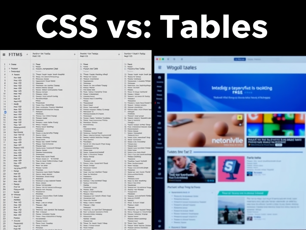
Comparing Tables and Style Sheets for Modern Web Design
Understanding Table-Based Layouts
In the early days of the internet, HTML tables were the go-to method for organizing content on a webpage. Designers would use ,, and “ tags to arrange elements, treating the entire site as one big spreadsheet. This made sense at the time—CSS was still young, and browsers offered limited layout control. However, as design expectations evolved and accessibility standards improved, developers recognized that tables weren’t designed for page structure but for tabular data.
The fundamental issue with table layouts lies in their complexity and rigidity. Once a table-based site is created, even the smallest adjustment—like resizing a sidebar or moving an image—can require editing multiple rows and columns. Moreover, such designs are non-semantic, meaning that search engines and screen readers struggle to understand the true hierarchy of information. For instance, a user relying on assistive technology might have to read through unnecessary markup before reaching the content they need.
While it’s possible to create visually appealing designs using tables, this approach quickly becomes a maintenance nightmare. According to W3C recommendations, structural layout should be handled through CSS because it separates a site’s content (HTML) from its presentation (design). Using tables for layout can also increase load times, as browsers must interpret more markup, and this directly affects user experience and SEO ranking.
Advantages of Using CSS for Layouts
CSS (Cascading Style Sheets) revolutionized modern web development by separating structure from style. With CSS, layout and design can be modified independently of the content, allowing updates to be made more efficiently. Features like Flexbox and CSS Grid have made it easier to create responsive websites that look great across multiple devices—something tables could never do efficiently.
Here are a few powerful advantages of CSS-based layouts:
- Flexibility and responsiveness: CSS grids and flex properties enable dynamic resizing for mobile, tablet, and desktop displays.
- Clean, semantic markup: HTML remains for structure, CSS handles design—improving accessibility, SEO, and collaboration.
- Faster load times: Less markup means smaller file sizes and quicker page loads.
- Easier maintenance: One stylesheet can define multiple pages, ensuring design consistency across an entire website.
In practical terms, switching to CSS layouts not only reduces development time but also future-proofs your site. When CSS media queries and frameworks such as Bootstrap, Tailwind CSS, or Foundation are used, a website automatically adapts to user screen resolutions, saving developers from maintaining multiple versions of the same page.
Pros and Cons: CSS vs. Table Layouts
Every choice comes with trade-offs, and understanding them will help you decide what suits your unique situation best.
CSS Layouts – Pros:
- Streamlined maintenance and design scalability
- Works well with responsive design
- Better SEO performance and accessibility compliance
- Light and fast to load
CSS Layouts – Cons:
- Requires knowledge of newer design techniques like CSS Grid or Flexbox
- Older browsers may have rendering issues (though largely outdated)
Table Layouts – Pros:
- Familiar to older developers and compatible with classic email formats
- Predictable structure for simple, fixed-layout components
Table Layouts – Cons:
- High code complexity and poor maintainability
- Difficult to adapt for mobile devices or responsive design
- Poor accessibility and longer load times
According to a WebAIM study (2023), nearly 72% of accessibility concerns stem from poor semantic structure—something table layouts exacerbate. In contrast, CSS-based layouts score higher on accessibility audits, making them the recommended choice for both professional developers and accessible design advocates.
Real-World Examples Showing Why CSS Layouts Outperform Tables
Case Study 1: From Legacy to Modern at a Small Business Website
One illustrative example comes from a small e-commerce store that used table-based design to display products. Every change to the site required manual HTML editing—time-consuming and prone to human error. After switching to a CSS-based Grid layout, the business saw a 40% reduction in page load time and a 50% reduction in maintenance hours per month.
Sites adopting CSS frameworks, like Bootstrap (https://getbootstrap.com) or Tailwind CSS (https://tailwindcss.com), benefit from consistency and responsiveness across devices. Furthermore, accessibility improvements led to better search rankings and reduced bounce rates. This demonstrates how CSS layouts not only enhance aesthetics but also positively impact technical and business performance metrics.
The migration to CSS also simplified collaboration. Designers focused solely on visual refinements in the stylesheet while content editors worked purely in HTML. This separation of concerns—something impossible with nested tables—enhanced productivity and reduced the risk of human-induced formatting errors.
Case Study 2: Large-Scale Website Overhaul and Plugin Compatibility Issues
When a nonprofit organization modernized its older table-based website, they encountered significant plugin compatibility issues. Many WordPress and Joomla plugins rely on modern CSS container structures like and rather than tables. Legacy layouts often broke when newer plugins attempted to apply styling dynamically, forcing costly patchwork fixes.
During the migration, their web team replaced the old markup with semantic HTML5 elements and a responsive CSS Grid layout. This update allowed them to use plugins for sliders, forms, and analytics without layout conflicts. The modernization also enabled them to integrate accessibility plugins that supported screen readers properly—a crucial improvement for their mission-driven audience.
Troubleshooting Tip:
When transitioning from a table layout to CSS:
- Test plugin compatibility on a staging environment first.
- Use browser developer tools to identify broken structure elements.
- Verify that older CSS files or inline styles aren’t overriding new classes.
For in-depth troubleshooting, consult professional support services such as Archer IT Solutions Support or community forums like CSS-Tricks (https://css-tricks.com) and MDN Web Docs (https://developer.mozilla.org).
Case Study 3: Performance and SEO Comparisons
Performance optimization is a driving factor in modern web design. In a 2022 experiment by Smashing Magazine, two identical websites—one using tables, the other CSS Grid—were compared. The CSS site loaded 32% faster on average and ranked higher in Google’s Core Web Vitals, largely because of its cleaner markup and reduced render-blocking.
SEO experts agree that Googlebot prioritizes semantic HTML and mobile responsiveness. CSS layouts allow developers to rearrange elements visually without changing the document’s logical order—something table structures cannot achieve cleanly. The result is better indexing, user satisfaction, and visibility.
Additionally, mobile-first indexing by Google necessitates a responsive approach powered by CSS media queries. Table layouts, being rigid, require more code hacks or horizontal scrolling on smaller screens, both detrimental to the user experience. This is why major hosting providers and developers, including Archer IT Solutions’ web design services (link), recommend adopting a CSS-centric strategy for long-term success and scalability.
Troubleshooting Common Plugin and Layout Conflicts
When switching from tables to CSS, developers sometimes face challenges ensuring plugins or site components display correctly. Common problems include floating containers collapsing, missing widths, or misaligned images. These usually occur because the new CSS rules conflict with JavaScript or plugin-generated HTML.
Troubleshooting Checklist:
- Validate your code using tools like W3C Validator (https://validator.w3.org) to identify mismatched tags.
- Clear cache after updating your CSS or themes—old versions may be stored by browsers.
- Use browser inspection tools (Chrome DevTools, Firefox Inspector) to trace broken styles.
- Check media query triggers: sometimes the issue is as simple as a missing mobile breakpoint.
- Seek expert support if errors persist—reputable firms such as Archer IT Solutions can help diagnose deeper compatibility issues through both onsite and remote troubleshooting.
One helpful approach is to build new layouts on top of a tested CSS framework rather than coding every line manually. That minimizes rendering discrepancies and improves plugin interaction.
Practical Guidelines for Choosing Between Tables and CSS
Before deciding, consider the site’s content type and long-term scalability. Tables still have their appropriate uses—mainly for presenting tabular data such as pricing grids or product comparisons. But for the page’s main layout, CSS remains the far superior option.
Ask yourself these key questions:
- Is your audience primarily accessing the site via mobile or desktop?
- Will you integrate interactive plugins or CMS-based components?
- Do you care about SEO rankings and accessibility compliance?
If the answer to these is “yes,” CSS wins by a landslide. And if you lack in-house expertise, using professional support—like Archer IT Solutions’ Managed IT Support (link)—can ensure that your transition is smooth and your site structured for long-term success.
You can also visit reputable non-commercial educational references such as:
- MDN Web Docs – CSS Layouts Overview
- W3Schools – CSS Flexbox Tutorial
- Smashing Magazine – Building Responsive Layouts
Key Takeaways
- CSS provides flexibility, accessibility, and scalability, while tables should be used only for tabular data.
- Responsiveness and SEO gains from CSS layouts contribute directly to better user experience and ranking.
- Frameworks like Bootstrap and Tailwind CSS simplify layout design and troubleshooting.
- Professional IT and Web Support, such as Archer IT Solutions offers, can guide migrations and maintenance.
When developing or modernizing your website, choose a strategy aligned with performance and user experience goals. CSS offers every advantage for speed, optimization, and design control, while keeping your markup clean and compliant with current W3C standards.
Designing your website involves balancing creativity with functionality—and that starts with choosing the right layout method. While tables may feel familiar or seem simpler for static pages, CSS delivers power, flexibility, and future-readiness for modern sites. Responsive design, accessibility, and plugin compatibility all hinge on how your layout is structured.
If you currently rely on tables, consider testing a CSS-based layout in a sandbox environment or speak with professionals who can assist you in making the transition efficiently. Archer IT Solutions provides complete support for web hosting, design, and IT services, ensuring that your technical foundation aligns perfectly with today’s best practices. You can reach their support team at support@archer-its.com or raise an official ticket at www.archer-its.com/ticket/.
Ultimately, the choice between tables and CSS should reflect your goals, skills, and commitment to long-term growth. Take time to evaluate the needs of your website and its users. Whether building from scratch or modernizing an existing platform, adopting a CSS-based layout is a decision that will pay off in performance, maintainability, and professional polish for years to come.
Fast, Reliable Web Hosting — Starting at $1.99/month
|
🔥 Most Popular Standard Plan | Domain Only | |
|
$1.99/month Limited-time offer | Secure your business name online | |
|
Affordable yearly pricing Easy setup Works with any hosting | |
Reseller Hosting (For Agencies & Developers)Start your own hosting business or manage client sites | ||
| Reseller 1 | Reseller 2 | Reseller 3 |
| $20/month | $37.50/month | $50/month |
|
|
|
| ✔ 99.9% uptime • ✔ Secure • ✔ Easy setup • ✔ Local support | ||
Stop settling for slow, unreliable hosting. With Archer IT Solutions, get a website hosting plans that deliver speed, security, and 99.9% uptime guarantee. Grab your domain and hosting package in one seamless plan, optimized for WordPress users, small and medium size businesses, and personal websites.
Enjoy affordable web hosting plans without compromises unlike the big guys. Complete with professional email, one-click CMS installs, and round-the-clock hosting support. Perfect for WordPress users.
Built for Real Businesses
Whether you’re launching your first blog or scaling a growing business, Archer IT gives you:
+ Speed that keeps visitors engaged
+ Reliability you can count on
+Tools that actually make sense
Launch your first personal blog or scale a growing small business site with hosting optimized for performance. Get the best web hosting for plus simple setup — all powered by secure Linux servers and easy Plesk control panel.
Why Choose Archer IT Hosting?
🔒 Free SSL Certificates (Security + SEO Boost)
📧 Professional Email Accounts Included
⚡ Fast Linux Servers (Optimized Performance)
🧩 One-Click WordPress, Joomla & Drupal Installs
💬 Real 24/7 Support — No Bots, Just Help
💾 Automatic Backups for Peace of Mind
Risk-Free Guarantee
Try it with confidence.
If it’s not right for you, get your money back within 15 days.🔥 Don’t Wait — Launch Your Website Today
Stop overpaying for slow hosting.
Get everything you need in one simple plan.
Your website stays online with uptime, protected by a free SSL certificate, and supported by real people around the clock. And if it’s not right for you? Our 15-day money-back guarantee makes it a no-risk choice. Take your business or personal project online with hosting that’s secure, affordable, and built to perform.
💬 Real Support. No Runaround.
Unlike big hosting companies, you get:
- Direct help from real people
- No ticket delays
- No upsell traps
Discover more from Archer IT Solutons
Subscribe to get the latest posts sent to your email.
Discover more from Archer IT Solutons
Subscribe to get the latest posts sent to your email.
No responses yet