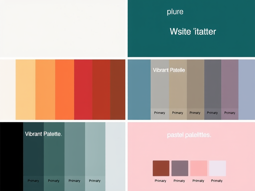
Color Palette for Websites
1. Minimalist Palette
- Background: #FFFFFF (White)
- Primary Text: #333333 (Dark Gray)
- Accent Color: #007BFF (Blue)
- Secondary Text: #666666 (Light Gray)
- Borders: #E7E7E7 (Light Silver)
2. Vibrant Palette
- Background: #F0F8FF (Alice Blue)
- Primary Text: #FF4500 (Orange Red)
- Accent Color: #32CD32 (Lime Green)
- Secondary Text: #4169E1 (Royal Blue)
- Borders: #FFFAFA (Snow)
3. Earthy Palette
- Background: #F3E5AB (Light Beige)
- Primary Text: #4B3C3A (Dark Brown)
- Accent Color: #D5B7A1 (Muted Pink)
- Secondary Text: #8B4513 (Saddle Brown)
- Borders: #D2B48C (Tan)
4. Dark Mode Palette
- Background: #181818 (Very Dark Gray)
- Primary Text: #FFFFFF (White)
- Accent Color: #3CB371 (Medium Sea Green)
- Secondary Text: #B0B0B0 (Gray)
- Borders: #444444 (Dark Gray)
5. Pastel Palette
- Background: #FFF0F5 (Lavender Blush)
- Primary Text: #6A5ACD (Slate Blue)
- Accent Color: #FFB6C1 (Light Pink)
- Secondary Text: #FFD700 (Gold)
- Borders: #E6E6FA (Lavender)
Tips for Selecting a Color Palette:
- Consider Your Brand: Ensure the colors reflect your brand’s identity.
- Contrast for Readability: Make sure there’s enough contrast between background and text for readability.
- Limit Your Palette: Stick to 3-5 main colors to keep the design cohesive.
- Test on Devices: Check how the colors appear on different screens and lighting conditions.
Feel free to mix and match elements from different palettes according to your design needs!
Discover more from Archer IT Solutons
Subscribe to get the latest posts sent to your email.
No responses yet