How to Build a Data Analyst Website for Clients
Running a data analyst business requires more than just technical expertise—it requires a digital presence that reflects precision, clarity, and insight. The website you choose acts as both a portfolio and a proof of your analytical capabilities. But what type of website should a data analytics firm have to attract clients, establish credibility, and communicate complex data-driven services clearly? In this article, we’ll explore how to design a data analysis website strategically—covering design style, structure, technical considerations, and even troubleshooting advice for plugin issues.
Choosing the Right Website Style for Data Analysts
Creating the right website for a data analytics business starts with understanding the purpose: to build trust through data transparency. Your website style should embody professionalism, clarity, and a data-driven aesthetic. For example, websites like Tableau Public or Kaggle demonstrate how visualization and layout can communicate powerful insights quickly. They rely on minimalist design and intuitive navigation, allowing users to focus on interpretation rather than distraction. As a data analyst, your site must present dashboards, case studies, and reports in ways that engage clients while demonstrating analytical depth.
When thinking of website style, consider visual hierarchy—where attention naturally flows from the top-left to the center. Data-centric websites benefit from layouts that guide users using clear headlines, ample white space, and contrasting call-to-action (CTA) buttons. For example, showcasing portfolio projects under meaningful headers (“Predictive Analytics for Marketing,” “Financial Data Visualization”) allows potential clients to scan quickly. Studies show that users spend an average of 5.59 seconds reading the main headline before deciding to explore further, according to Nielsen Norman Group. That brief window highlights the importance of a concise message and immediate visual credibility.
The pros and cons of different website styles are worth noting before development:
Pros:
- Clean, data-driven designs instill confidence and represent your analytical mindset.
- Interactive features (e.g., sample dashboards) can demonstrate technical ability instantly.
Cons: - Overloading the site with visualization plugins can slow performance.
- Poor mobile responsiveness (still common in data-heavy sites) can alienate users accessing via smartphones.
To strike a balance, it’s often wise to partner with IT or hosting professionals who understand analytics-driven design. For instance, Archer IT Solutions offers web design services and web hosting solutions tailored for performance and reliability—helping businesses like yours avoid downtime or slow-loading analytics visualizations.
Structuring Your Data Analytics Site for Maximum Impact
A powerful site structure for a data analytics business should reflect both depth and simplicity—easy enough for clients to navigate, yet robust enough to demonstrate technical prowess. Consider organizing your site into five key sections: Home, Services, Portfolio, Blog/Insights, and Contact. Each should serve a distinct function:
- Home: Highlight your unique value proposition with compelling visualization or data case summaries.
- Services: Detail offerings such as “Data Mining,” “Predictive Modelling,” “Data Visualization,” or “Machine Learning Integration.”
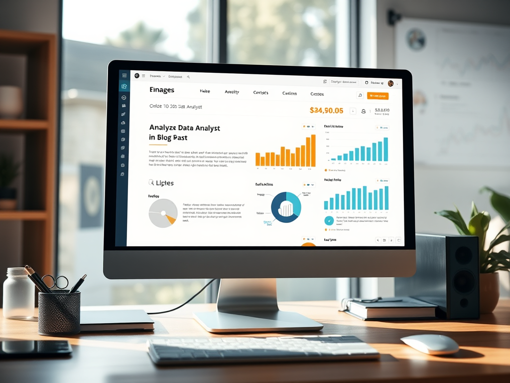
- Portfolio: Use screenshots or embedded dashboards to illustrate successes.
- Insights/Blog: Publish case studies on trending analytical topics—like how data impacted retail sales or health forecasting.
- Contact: Provide quick access to your email, form, and technical support channels.
Your structure should also encourage scanning patterns, allowing visitors to quickly locate relevant information. Research suggests that users follow an “F-pattern” when reading web content—scanning across the top for headlines and down the left-hand column for quick access points. Using subheadings, short paragraphs, bullet points, and visual cues like icons or charts will keep your visitors engaged longer. For instance, adding subtle motion graphics for transitions between sections can emphasize sophisticated thinking without being excessive.
Technical optimization plays a huge role as well—especially if you embed interactive dashboards. Choose a reliable hosting provider capable of handling heavy data visualization loads. Archer IT Solutions’ managed IT support can help maintain performance by managing server resources and plugin updates. Additionally, site load time directly affects user retention—according to Google, a difference of even one second in load time can reduce conversions by up to 20%. A streamlined hosting plan ensures your analytics visuals remain fast and functional across devices.
Troubleshooting Plugin Compatibility
Data analytics sites often depend on plugins—for charts, dashboards, or APIs. However, not all plugins play well together. A common issue is compatibility between data visualization plugins (like Chart.js or D3.js) and WordPress themes or caching plugins. Symptoms include broken charts or misaligned datasets. Troubleshooting these problems might involve:
- Deactivate plugins one by one to isolate the conflict.
- Check for version mismatches—older visualization plugins may require a legacy script or upgraded jQuery version.
- Use staging environments provided by web hosts like Archer IT Solutions’ web hosting service to test updates safely before deployment.
- Avoid redundant plugins; often a single, lightweight visualization tool can replace several heavy ones.
If technical troubleshooting becomes overwhelming, reach out for professional support. Archer IT Solutions provides dedicated support via their ticket system or directly through support@archer-its.com, with responses typically within 24 hours. This ensures your website runs smoothly and any plugin or server issues are quickly resolved, minimizing downtime.
Pros and Cons of Self-Build vs. Professional Design
When launching a data analyst site, one of the first decisions is whether to build the website yourself or hire professionals.
Self-Build Pros:
- Full creative control over design and content.
- Lower initial cost.
- Flexibility to experiment with new visualization tools.
Self-Build Cons:
- Time-intensive; managing both analysis and web development can affect productivity.
- Technical issues (like plugin conflicts or broken dashboards) may be challenging without hosting support.
- May lack polish or advanced features expected by clients.
Professional Design Pros:
- Expert teams understand web performance optimization and responsive design.
- Ongoing maintenance and updates prevent technical headaches.
- Better scalability for growing client traffic or extended services.
Professional Design Cons:
- Higher upfront cost.
- Possible dependency on external teams for future updates.
Ultimately, the best approach depends on your technical comfort level, time availability, and growth expectations. Businesses focused more on analytics than IT may find it efficient to rely on partnerships with trusted companies such as Archer IT Solutions, which offers web hosting, remote support, and design services under one roof.
Real-Life Example and Industry Inspiration
A great illustration of a successful data analytics website approach can be seen with Our World in Data. They combine interactive visualizations with clean typography and logical structure, enabling visitors to explore complex topics like global health or economics effortlessly. Another example, Datawrapper, balances data visualization and user experience, providing responsive charts that adapt beautifully across devices.
By referencing such designs, you can identify recurring elements:
- Simplified color palettes highlighting key data points.
- Interactive dashboards that allow users to explore metrics.
- Strategic content placement using white space to reduce cognitive load.
Your business can apply similar principles while tailoring the design to emphasize your analytical niche. Whether you focus on finance, healthcare, or e-commerce data, adapt your visual language—charts, icons, and typography—to the industry’s communication norms.
Tools and Resources for Design and Hosting
For data analysts looking to streamline technical setup, a combination of the following tools can help:
- WordPress or Webflow for easy content management.
- Plotly or Tableau Public for embedding interactive visualizations.
- Google Data Studio for client dashboards.
- Archer IT Solutions’ hosting and IT support for ensuring secure, high-performance environments.
- Canva or Figma for quick, non-coding design adjustments.
These resources let you stay efficient while focusing on your main goal—delivering outstanding insights. Regularly updating your blog with case studies and trend reports keeps visitors engaged and boosts search engine visibility.
Your data analytics website isn’t just an online business card—it’s your digital research lab, your portfolio, and often your primary communication channel. Choosing the right style and structure can determine whether visitors stay or leave after a few seconds. Reflect on your business goals: do you need an interactive, dashboard-driven site or a narrative-style layout with strong storytelling?
If technical setup or troubleshooting proves too complex, remember services like Archer IT Solutions provide dependable web hosting, onsite support, and managed IT services that let you focus on analytics rather than backend issues. For assistance, visit their support portal or email support@archer-its.com—most inquiries receive a response within 24 hours.
Ultimately, your website should mirror the precision, clarity, and foresight that define your work as a data analyst. Take time to plan your layout, prioritize intuitive design, and align every choice—colors, spacing, and flow—with the analytical value you promise your clients. Strive for a site that informs, inspires, and invites collaboration—the true hallmark of a professional analyst’s online presence.
Suggested Image Ideas:
- A laptop screen displaying colorful data visualizations.
- A clean homepage wireframe with focus points highlighted in the top-left region.
- A side-by-side comparison of a cluttered vs. minimalist analytics dashboard.
- A team of analysts reviewing digital dashboards in a modern workspace.
Get 3 months of the $9.99 hosting on us.
WordPress – PHP – EMAILS – FTP – Databases – Lots more
Discover more from Archer IT Solutons
Subscribe to get the latest posts sent to your email.
Discover more from Archer IT Solutons
Subscribe to get the latest posts sent to your email.
No responses yet