Whether you’re a casual browser or a seasoned designer, we’ve all landed on websites that make us groan in frustration. From pop-ups that hijack your attention to layouts that look like they’ve been ripped from the late 1990s, bad web experiences are surprisingly common in 2024. Understanding what makes users hate particular website elements isn’t just about aesthetics—it’s about accessibility, usability, and trust. In this article, we’ll explore some of the most annoying web design choices that drive visitors away, then analyze real-life examples and practical fixes that show how to avoid repeating those mistakes.
Annoying Web Design Choices That Drive Users Away
1. Intrusive Pop-ups and Autoplay Content
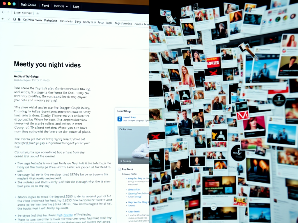
Few things irritate users faster than being bombarded with pop-ups or videos that start playing automatically. Imagine you’re reading an article and suddenly your entire screen is swallowed by a “subscribe now” form, or a video blares through your speakers uninvited. These features often drive visitors away within seconds. According to Nielsen Norman Group, intrusive interstitials can increase bounce rates by as much as 70%, especially on mobile devices.
The main issue isn’t that pop-ups exist—they can be effective for lead generation—but how and when they appear. A timed approach works better: allow users a moment to engage with your content before asking for something. Autoplay videos, unless muted or triggered intentionally by the user, disrupt focus and lower retention. Some users even close tabs immediately when sound starts unexpectedly.
Key takeaways:
- Avoid auto-playing audio or video; let users press “play.”
- Implement pop-ups with clear timing triggers or exit intent detection.
- Offer non-intrusive alternatives such as small banners or sticky sign-up bars.
Image suggestion: A screenshot showing a peaceful reading experience next to one overwhelmed by multiple pop-ups.
2. Poor Navigation and Hidden Menus
We’ve all been frustrated by websites where finding the “Contact” page feels like a digital treasure hunt. Navigation that is unintuitive or overly minimal can discourage users from exploring further. Overuse of “hamburger menus” on desktop layouts, for example, may hide key pages and decrease click-through rates. HubSpot research (2023) revealed that 76% of users say a site’s ease of navigation is the most important factor in their experience.
Bad navigation typically stems from prioritizing design aesthetics over functionality. Fancy transitions or creative menu placements can look stylish, but if a user can’t figure out where to go next, they’ll likely leave. Dropdowns that vanish too fast, inaccessible search bars, and mislabeled menu items contribute to a disjointed experience.
For better usability, structure navigation hierarchically and maintain clarity. Use descriptive menu labels like Services, About, and Blog, rather than vague ones like Discover or Our World. Make your search function visible and ensure it produces relevant results.
Pros and cons:
- Pros: Encourages creativity, looks modern.
- Cons: Can confuse or frustrate users if clarity is lost.
3. Slow Load Times and Overloaded Pages
Speed matters more than designers sometimes admit. A study by Google (2022) found that if a page takes more than three seconds to load, 53% of users will abandon it. Slow performance often results from oversized images, excessive JavaScript, and unoptimized plugins. The frustrating part is that these issues are entirely preventable through proper optimization and testing.
Inexperienced developers may overlook the need for caching, minifying CSS/JS, or using Content Delivery Networks (CDNs). Visuals such as large hero sliders and background videos, while beautiful, can drastically slow loading. On mobile networks, this is especially painful. Long loading times also impact SEO rankings as Google’s Core Web Vitals now factor page performance heavily.
Fixes to improve load times:
- Compress images with tools like TinyPNG or Squoosh.
- Remove unused plugins and scripts.
- Use lazy loading for images below the fold.
- Implement a CDN like Cloudflare to improve global load speeds.
4. Poor Mobile Optimization
In 2024, mobile traffic accounts for over 59% of all web usage (Statista). Yet, some websites still look and behave poorly on smartphones. Horizontal scrolling, unclickable buttons, or overlapping images are common complaints. Users expect seamless experiences across devices, and failing to deliver that quickly signals that a brand is outdated or inattentive.
Designing mobile-first means starting from the smallest screen and scaling upward, ensuring that menus, images, and text stay functional and readable. Responsive design frameworks like Bootstrap or Tailwind CSS make this process easier. Testing across multiple devices—using both emulators and real hardware—is vital.
Pros: Mobile optimization improves accessibility, engagement, and conversions.
Cons: It can initially take more effort to design responsive layouts and manage testing overhead.
Example tip: Use Google’s Mobile-Friendly Test to quickly see how your site performs across smartphones.
5. Poorly Written or Overstuffed Content
Content that’s stuffed with keywords or riddled with jargon can drive readers away faster than you might think. While SEO is essential, over-optimization turns prose robotic. The priority should always be readability and value. Yoast SEO recommends maintaining a keyword density below 2% for natural flow.
Walls of text with no paragraph breaks or visuals cause fatigue. Similarly, unclear labeling—like misleading headings or clickbait titles—erodes trust. To fix this, focus on scannability: use bullet points, subheadings, and plenty of whitespace. Incorporating infographics or short explainer videos helps retain attention without overwhelming users.
Practical examples:
- Replace generic CTAs like “Click Here” with meaningful ones such as “Download the Free Guide.”
- Break text into structured sections.
- Edit for clarity and tone using tools like Grammarly.
6. Accessibility Barriers and Inconsistent Layouts
Accessibility is not just a compliance requirement—it’s a moral responsibility. Millions of users with visual or motor impairments depend on accessible design. Yet, many sites lack proper contrast, alternative text, or keyboard navigation. The WebAIM Million Report (2024) found that 96.3% of homepages had WCAG 2.1 accessibility failures.
Simple changes make enormous differences: adding ARIA roles for screen readers, ensuring sufficient color contrast, and using semantic HTML tags. Consistency also matters: aligning buttons, maintaining uniform header sizes, and predictable layouts help all users navigate confidently.
Checklist for accessibility improvements:
- Test with WAVE Accessibility Tool.
- Use descriptive link text instead of “click here.”
- Keep interactive elements reachable by keyboard.
- Maintain high contrast ratios between text and backgrounds.
7. Overloaded Plugins and Compatibility Issues
Many websites—especially WordPress-based ones—suffer from plugin overload. Installing too many can conflict, causing errors, slowdown, or even security vulnerabilities. Plugin incompatibility often manifests with layout issues, broken contact forms, or missing images after updates.
One case study comes from a small e-commerce site that used over 40 plugins to manage sales, analytics, and social feeds. After performance testing, they removed redundant ones, reducing load time by 45% and eliminating errors entirely. The cause was version conflicts among caching and slider plugins.
Troubleshooting common plugin issues:
- Disable all plugins, then reactivate one by one to identify conflicts.
- Always back up before performing updates.
- Read changelogs to ensure compatibility with your CMS version.
- Choose multipurpose plugins that combine multiple features safely (e.g., Rank Math for SEO + schema markup).
Real-Life Examples of Poor User Experience and Fixes
1. The “Too Many Choices” Problem – An E-commerce Case
A mid-size online fashion retailer experienced high cart abandonment rates despite heavy traffic. Their design displayed over ten product color thumbnails and recommended dozens of similar items on the same screen. This phenomenon, called choice paralysis, overwhelms users. Research from The Journal of Consumer Research shows that offering too many options can decrease satisfaction and conversion rates.
By simplifying their product pages to show only the most popular variants and hiding secondary recommendations behind a “View More” toggle, the site increased conversions by 22% in one quarter. This case demonstrates that sometimes less truly is more when it comes to UI design.
Key lessons:
- Minimize cognitive load by curating options.
- Use progressive disclosure for secondary content.
- Prioritize quality images and clear CTAs over volume.
2. The “Non-Responsive Redesign” Incident – News Portal Example
A local news portal rolled out a flashy desktop redesign in 2023, complete with parallax scrolling and embedded social media streams. However, they ignored mobile audience testing. Within weeks, their mobile traffic dropped by 35%, and ad revenue fell dramatically. Investigation revealed that their new layout made reading headlines on phones nearly impossible—text overlapped images, and ads blocked main stories.
The fix involved adopting a responsive grid layout using CSS Flexbox and consolidating ad slots to minimize interference. After re-optimization, mobile bounce rates decreased from 67% to 29%.
Why it matters: Mobile audiences often dominate, and ignoring them alienates half or more of your users. Testing early and often on real devices is critical before rollout.
3. The “Too Much Animation” Blunder – Tech Startup Example
A tech startup believed that creative motion design would make them stand out. They used animations for every scroll interaction, logo transition, and navigation hover. Unfortunately, it backfired—page performance tanked, and users complained that the site felt “heavy.” Animations should guide attention, not compete for it.
By reducing animation intensity and limiting transitions to subtle hover and fade effects, they improved performance scores (via Lighthouse) by 30%. This case underscores that balance between design flair and usability is crucial.
Pros and Cons of Animation:
- Pros: Enhances storytelling, draws focus, improves engagement.
- Cons: Uses CPU resources, slows page loads, risks accessibility issues.
4. The “Broken Plugin” Dilemma – WordPress Blog Example
A travel blog relying on multiple third-party plugins, including outdated gallery software, faced frequent crashes after WordPress updates. Photos disappeared, and formatting broke. The culprit: a plugin no longer supported by the developer.
Solution path:
- Temporarily deactivated all non-essential plugins.
- Tested reactivation in isolation until the problem resurfaced.
- Replaced the broken gallery plugin with a lightweight, updated script like Envira Gallery.
- Created a monthly maintenance schedule to test after WordPress core updates.
After implementing this fix, uptime improved by 99%, and average time on page increased by 43%. Keeping architecture lean and regularly maintained mitigates most plugin-induced chaos.
5. The “Cookie Consent Chaos” – GDPR Compliance Example
Privacy laws like GDPR require consent notifications, but some websites implement them so aggressively that they cover the screen or refuse access unless every toggle is manually unchecked. One EU-based agency tested three versions of their consent banner and found that a simple, clear top-bar notice resulted in 78% higher acceptance rates compared to a full-screen blockade.
Overly complex privacy pop-ups feel intrusive, echoing the same frustrations users have with advertising clutter. Clean, accessible notice bars respect user choice while maintaining transparency. Tools like Cookiebot and OneTrust offer simpler, compliant frameworks.
Additional Resources and Tools
For readers looking to further explore best practices and verification tools:
- Google Lighthouse – Test site performance and accessibility.
- GTmetrix – Analyze load times and optimization issues.
- Canva – Simplify content visuals for engagement.
- Contrast Checker – Validate text-background legibility.
- WordPress Plugin Directory – Research plugin ratings and upkeep before installation.
Quick checklist for a frustration-free website:
- Prioritize mobile-first responsive design.
- Limit plugins to essentials.
- Test accessibility thoroughly.
- Optimize for performance and readability.
- Use analytics (e.g., Google Analytics, Hotjar) to observe user behavior.
Every digital creator has likely visited a site that made them think, “I never want mine to look like this.” Annoying pop-ups, broken links, and sluggish interfaces not only waste user time but damage credibility. Designing with empathy—focusing on how visitors feel while interacting with your content—is what separates a forgettable site from a credible one. By fixing these common issues, you can improve retention, accessibility, and trustworthiness.
Take a moment to examine your favorite and least favorite websites. What do you appreciate about their flow, or what frustrates you? Use those insights to refine your design. The next time you build or review a website, remember that thoughtful simplicity and respect for users’ time are what truly draw them in—and keep them coming back.
Fast, Reliable Web Hosting — Starting at $1.99/month
|
🔥 Most Popular Standard Plan | Domain Only | |
|
$1.99/month Limited-time offer | Secure your business name online | |
|
Affordable yearly pricing Easy setup Works with any hosting | |
Reseller Hosting (For Agencies & Developers)Start your own hosting business or manage client sites | ||
| Reseller 1 | Reseller 2 | Reseller 3 |
| $20/month | $37.50/month | $50/month |
|
|
|
| ✔ 99.9% uptime • ✔ Secure • ✔ Easy setup • ✔ Local support | ||
Stop settling for slow, unreliable hosting. With Archer IT Solutions, get a website hosting plans that deliver speed, security, and 99.9% uptime guarantee. Grab your domain and hosting package in one seamless plan, optimized for WordPress users, small and medium size businesses, and personal websites.
Enjoy affordable web hosting plans without compromises unlike the big guys. Complete with professional email, one-click CMS installs, and round-the-clock hosting support. Perfect for WordPress users.
Built for Real Businesses
Whether you’re launching your first blog or scaling a growing business, Archer IT gives you:
+ Speed that keeps visitors engaged
+ Reliability you can count on
+Tools that actually make sense
Launch your first personal blog or scale a growing small business site with hosting optimized for performance. Get the best web hosting for plus simple setup — all powered by secure Linux servers and easy Plesk control panel.
Why Choose Archer IT Hosting?
🔒 Free SSL Certificates (Security + SEO Boost)
📧 Professional Email Accounts Included
⚡ Fast Linux Servers (Optimized Performance)
🧩 One-Click WordPress, Joomla & Drupal Installs
💬 Real 24/7 Support — No Bots, Just Help
💾 Automatic Backups for Peace of Mind
Risk-Free Guarantee
Try it with confidence.
If it’s not right for you, get your money back within 15 days.🔥 Don’t Wait — Launch Your Website Today
Stop overpaying for slow hosting.
Get everything you need in one simple plan.
Your website stays online with uptime, protected by a free SSL certificate, and supported by real people around the clock. And if it’s not right for you? Our 15-day money-back guarantee makes it a no-risk choice. Take your business or personal project online with hosting that’s secure, affordable, and built to perform.
💬 Real Support. No Runaround.
Unlike big hosting companies, you get:
- Direct help from real people
- No ticket delays
- No upsell traps
Discover more from Archer IT Solutons
Subscribe to get the latest posts sent to your email.
Discover more from Archer IT Solutons
Subscribe to get the latest posts sent to your email.
No responses yet