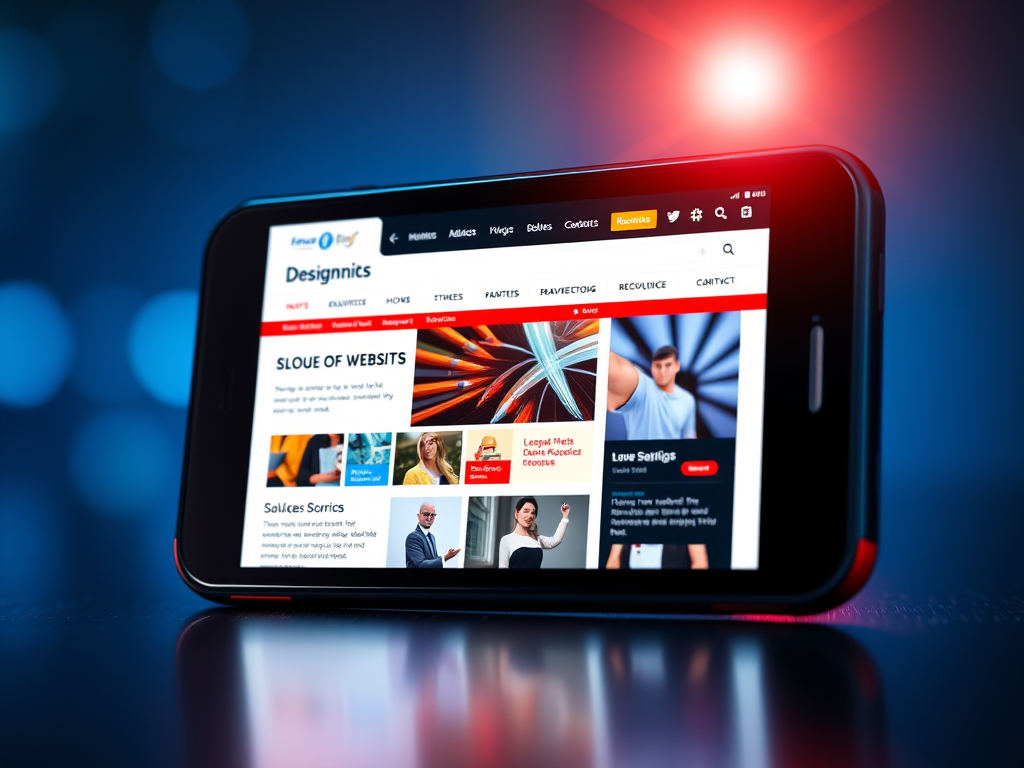
Designing Websites That Shine on Every Mobile Screen
Creating a website that looks stunning on a mobile device isn’t just about shrinking content—it’s about reimagining the experience for smaller screens. Mobile responsiveness is crucial in today’s digital era, where more than 60% of global web traffic comes from mobile devices (source: Statista). Successful mobile web design goes beyond resizing; it refines every touchpoint, visual, and scroll path to create usability harmony.
A strong mobile-friendly design ensures that users stay longer, engage better, and are more likely to convert. The focus must shift towards visual hierarchy, layout responsiveness, and content prioritization that guide a user’s eye naturally. For businesses like Archer IT Solutions—which supports website owners, developers, and small businesses—delivering seamless mobile experiences can significantly enhance client trust and satisfaction.
The following sections explore practical techniques for designing websites that shine on every device, including layout optimization, plugin compatibility troubleshooting, and insights on where visual attention truly matters.
Building Visually Engaging Mobile-Friendly Layouts
Designing a visually engaging site starts with understanding user scanning patterns. Most users follow an F-shaped or Z-shaped scanning pattern. That means key elements—like headlines, call-to-action buttons, and navigation menus—should be positioned strategically within these visual paths. By embracing clean white space and well-defined section breaks, designers can create smoother information flow and emphasize focus points.
Visual hierarchy plays a decisive role in guiding users toward what matters most. Using larger fonts for headlines, vibrant colors for buttons, and contrast-rich imagery helps direct user attention naturally. According to Nielsen Norman Group, properly structured layouts can improve comprehension and engagement rates by more than 20%. For instance, placing contact buttons in the top-left visible area can enhance accessibility and conversions.
Key Takeaways
- Position key content within user scanning zones (top-left or center).
- Use consistent spacing to distinguish sections and guide navigation smoothly.
- Focus on readability, aiming for fonts between 16–18px for body text.
Summary: An engaging mobile layout relies on an intelligent hierarchy of visuals, smart placement, and responsive white space. When executed right, it keeps users scrolling longer and interacting more.
Optimizing Design Elements for Every Screen Size
From typography to images, every pixel counts when rendering across multiple screen sizes. Responsive web design ensures that layouts adapt dynamically. Developers often rely on CSS Flexbox or Grid systems to achieve proportional scaling and consistent alignment. Proper use of breakpoints is key—these are the CSS-defined points that adjust the design based on screen width (e.g., mobile ≤480px, tablet ≤768px, desktop ≥1024px).
When it comes to images, optimization is essential. High-resolution images should be compressed using modern formats such as WebP or AVIF without sacrificing quality. Poorly optimized assets can drastically slow down mobile performance, frustrating users. Test your site responsiveness using tools like Google’s Mobile-Friendly Test or PageSpeed Insights.
Pros and Cons of Mobile Optimization
Pros:
- Increases user engagement and dwell time
- Enhances SEO rankings
- Boosts conversion potential
Cons:
- Requires ongoing maintenance and testing
- Some plugins or themes may not render correctly without updates
Summary: Optimizing for every screen size ensures seamless user experiences across devices, balancing aesthetics, functionality, and performance.
Common Issues: Plugin Compatibility and Troubleshooting
Even well-designed websites face issues when plugins don’t seamlessly integrate with mobile layouts. Common compatibility problems include overlapping menus, distorted images, or unresponsive sliders. Keeping plugins updated and testing them regularly in staging environments helps prevent disruptions. Always choose reputable plugin sources, and review change logs before each update.
If plugin conflicts persist, developers can disable plugins one at a time to isolate the issue. Using browser developer tools and CSS debugging can further identify display irregularities. For web hosting users, companies like Archer IT Solutions offer 24-hour support response for plugin conflicts, website performance issues, and mobile optimization concerns. Technical help can be accessed easily through support tickets or by emailing support@archer-its.com.
Summary: Regular monitoring and preventive maintenance reduce downtime. Partnering with qualified support providers ensures quick, professional troubleshooting when mobile compatibility challenges arise.
A great mobile-friendly website is more than just an attractive layout—it’s an immersive experience that anticipates user needs and behaviors. By focusing on scanning patterns, intuitive navigation, and adaptable elements, your design can truly shine on every device.
Whether you’re a small business owner or a web developer, now’s the perfect time to review how your site performs on smartphones and tablets. Visit Archer IT Solutions for expert assistance in achieving fluid, responsive web design backed by proactive technical support.
Reflect on your website’s goals—does it deliver clarity, speed, and usability on any screen? Enhancing your mobile design today could be the key to connecting better with tomorrow’s visitors.
Power your website with an affordable web hosting plan that does not cut corners.
 Mini |
Standard |
Domain Only |  Reseller 1 |
Reseller 2 |
Reseller 3 |
| $12 per year | $9.99/month | low yearly prices | $20/month | $37.50/month | $50/month |
| *10 GB Space** *100 GB Bandwidth** *FTP access *10 email account *PHP/CGI/PERL/SSI Support *SSL |
*100 GB Space** *1TB Bandwidth** *10 FTP accounts *100 email account *PHP/CGI/PERL/SSI Support *10 Databases *SSL WordPress, Joomla, or Drupal hosting |
*10 Domains *10 GB Diskspace *200 GB of traffic *10 Databases *10 Mailboxes *WordPress options |
*25 Domains *30 GB Diskspace *600 GB of traffic *30 Databases *30 Mailboxes *WordPress options |
*50 Domains *60 GB Diskspace *1200 GB of traffic *60 Databases *60 Mailboxes *WordPress options | |
| Specials | |||||
 3 months on us. 1TB Bandwidth, FTP accounts, email accounts, PHP/CGI/PERL/SSI SupportD, Databases, Ability to add WordPress, Joomla, or Drupal. 3 months on us. 1TB Bandwidth, FTP accounts, email accounts, PHP/CGI/PERL/SSI SupportD, Databases, Ability to add WordPress, Joomla, or Drupal.
Don’t wait — grab your deal and launch today ** temporary offered | |||||
Stop settling for slow, unreliable hosting. With Archer IT Solutions, get a robust website hosting plans that deliver speed, security, and the uptime. Grab your domain and hosting package in one seamless plan, optimized for WordPress, small businesses, and personal websites.
Enjoy affordable web hosting plans without compromises, complete with professional email, one-click CMS installs, and round-the-clock website hosting support. Built for Businesses. Perfect for WordPress. Take control of your online presence. Try it risk-free with our 15-day money-back guarantee.
Launch your first personal blog or scale a growing small business site with hosting optimized for performance. Get the best web hosting for plus simple setup — all powered by secure Linux servers and easy Plesk control panel.
Why Choose Archer IT Hosting?
- Free SSL Certificates – Protect customers & boost trust
- Custom Email Accounts included
- One-Click CMS Installs – WordPress, Joomla & Drupal ready
- 15-Day Money-Back Guarantee – Risk-free hosting
- 24/7 Customer Support and Service – Real help when you need it
- Features you’ll actually will use
- Powered by Linux for speed & reliability
- Simplified management with Plesk Control Panel
- Automatic backups for worry-free security
Trust. Reliability. Zero Guesswork.
Your website stays online with uptime, protected by a free SSL certificate, and supported by real people around the clock. And if it’s not right for you? Our 15-day money-back guarantee makes it a no-risk choice. Take your business or personal project online with hosting that’s secure, affordable, and built to perform.
Questions
Discover more from Archer IT Solutons
Subscribe to get the latest posts sent to your email.
Discover more from Archer IT Solutons
Subscribe to get the latest posts sent to your email.
No responses yet